McMaster Internship.
A graphic design internship journey at McMaster Automotive Resource Centre 🚀
my role.
Graphic Design Intern
team.
Vivi Sim (me!)
Jessica Petrunti (Supervisor)
Stine Hansen (Supervisor)
Sun Kyung Lee (Intern)
tools.
Figma
Adobe Photoshop
Adobe Illustrator
Adobe InDesign
Microsoft PPT
Microsoft Word
timeline.
8 months
overview
Driving the next generation.
McMaster Automotive Resource Centre, or MARC for short, is one of the world’s leading academic research programs in transportation electrification and smart mobility.
I was a part of an amazing, skilled team for my 8 months long internship at MARC, and had the chance to work on many projects during my time there.
This case study will talk about my learnings, successes, and experience I gained while working as a graphic design intern!
To comply with the non-disclosure agreement and with my supervisor’s permission, I have blurred the logos and changed text to lorem ipsum in some of the displayed work.
Challenge
Overcoming remote-work
communication barriers.
Although our team was small, we faced certain challenges that came along with working remotely most of the time. Our in-person day was Tuesday, and other days of the week we would communicate over Microsoft Teams.
I managed my own time to complete the assigned tasks on time and successfully collaborate with my fellow interns. The fruits of our collective labour are proudly displayed in this case study, wishing you a fun read! ✨



the first task
Getting mentored on
accessible design.
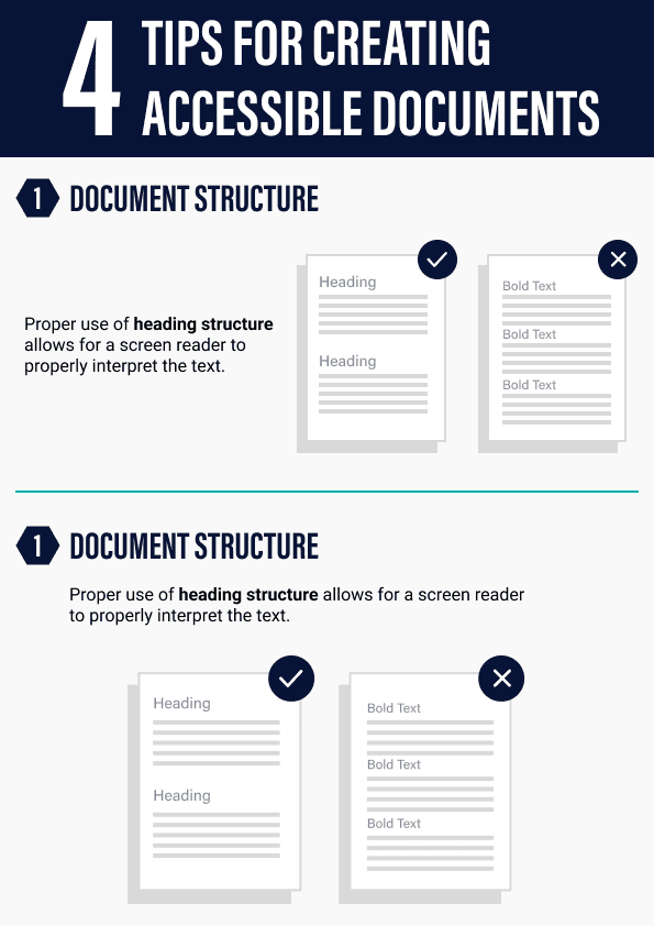
The first project I’ve worked on was all about accessibility and accessible learning!
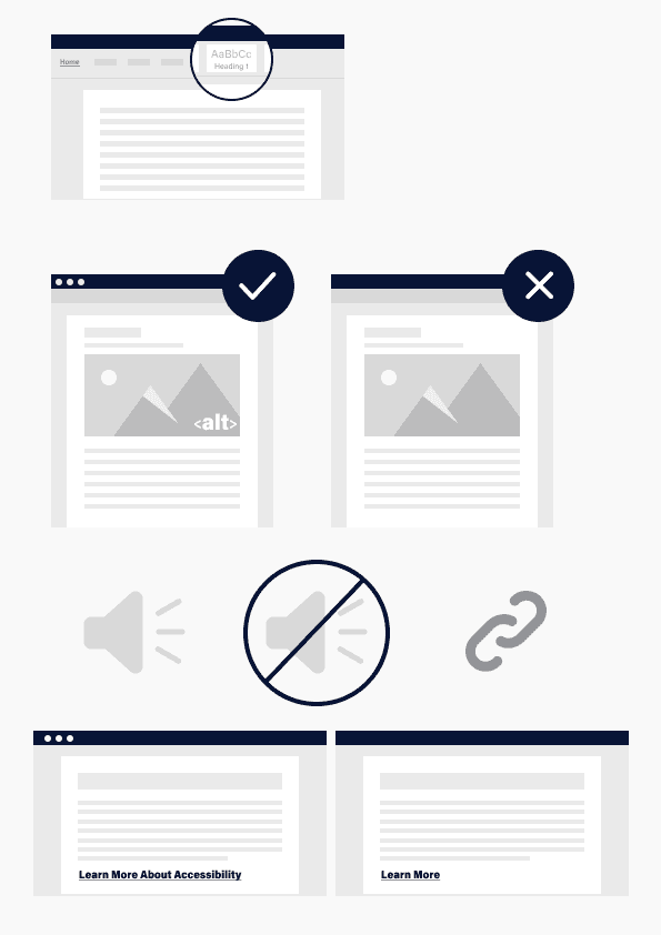
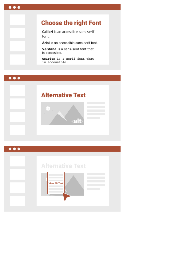
My mentor and supervisor Stine Hansen who specialises in accessibility tasked me with creating a series of instructional infographics for internal training.
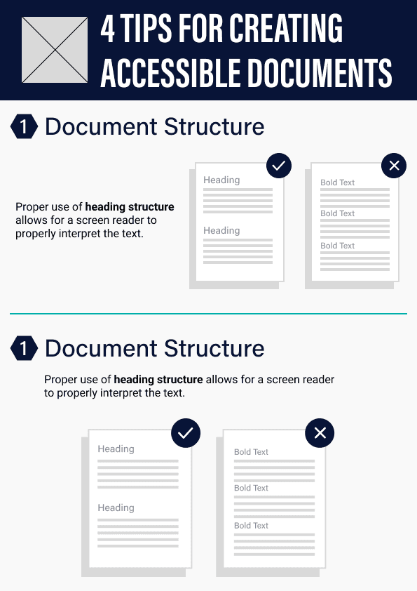
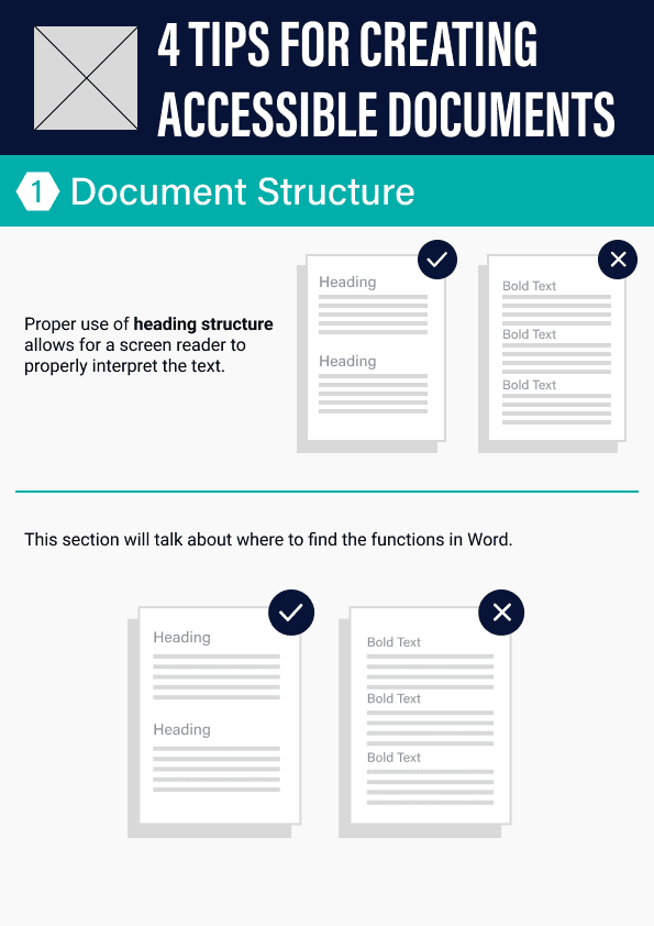
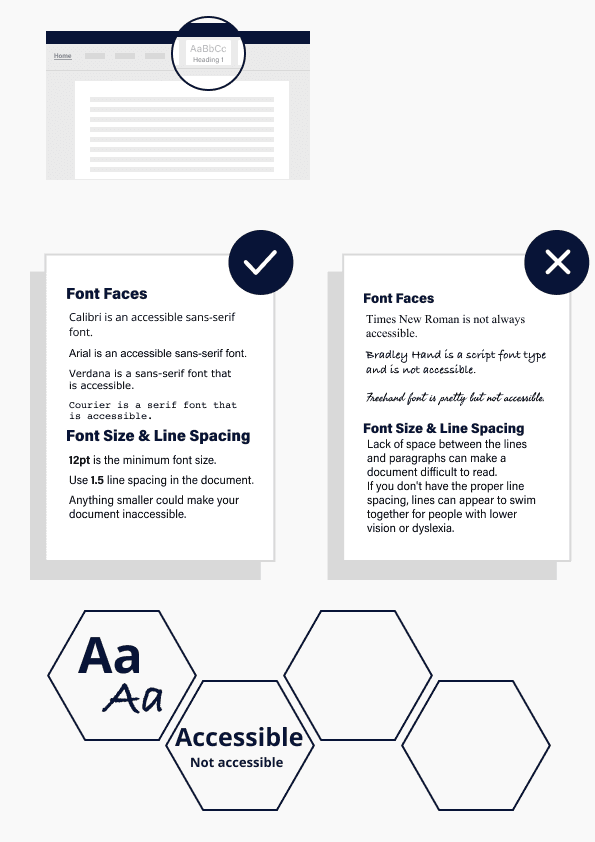
I worked together with Sun, a fellow graphic design intern, to create a series of infographics that teach about creating accessible documents in Microsoft Word and PPT. The infographics are based on the internal educational courses written by Stine.
process
I worked on creating the assets to use in the infographics in Adobe Illustrator. A lot of thought went into coming up with simple yet communicative designs constrained by the concise format and provided text.
Some important aspects I took into consideration when working on this task:
The branding - designing with the company’s branding guidelines in mind helped me improve my design skills by working with its constraint nature
Structure and layout - we were given the internal course that goes in more detail on creating accessible documents, condensing and visualising information with assets was the main challenge of this task
outtakes
With inclusivity and creative design at the forefront, the conclusion of this task has left me with new knowledge about the importance of accessible documents and ways to display educational information in an easy to digest infographic.
From thoughtful colour choices to meticulous typography, every element serves a purpose not just in everyday design, but when keeping accessibility of others in mind.
I took it upon myself to face the challenge of remote working by tackling design decisions on my own, and reaching out to Stine (supervisor) with questions regarding content that she provided.
Check out finished infographic designs below! 🌟


persona & journey
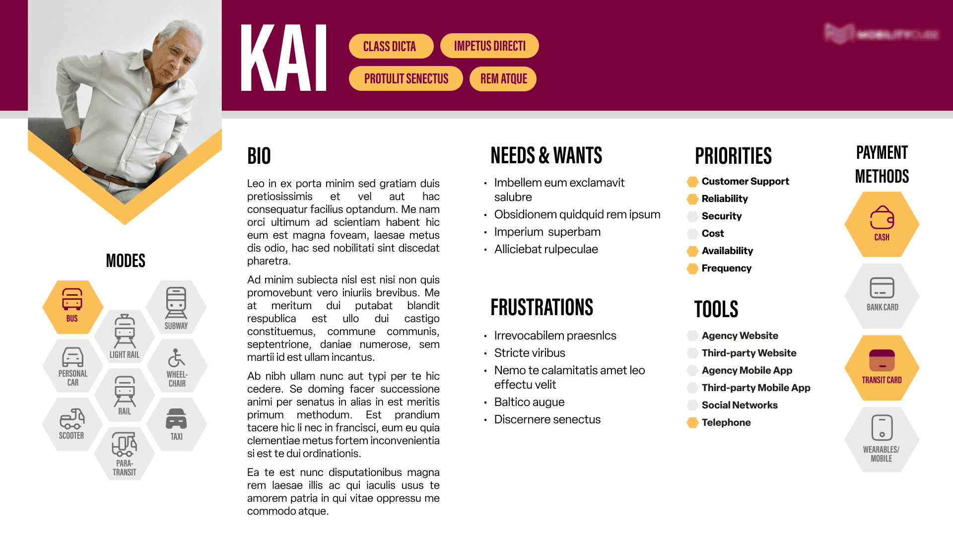
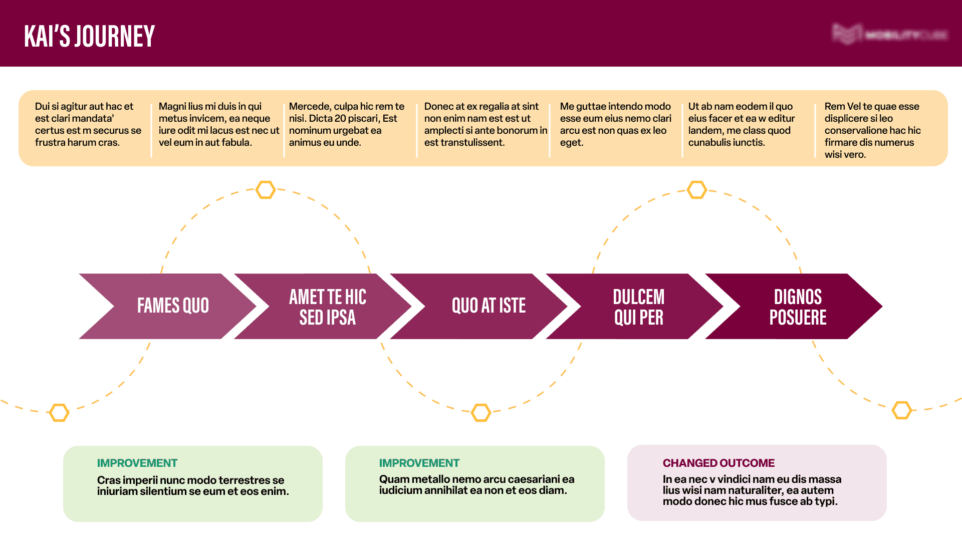
Turning text into stylish persona profiles.
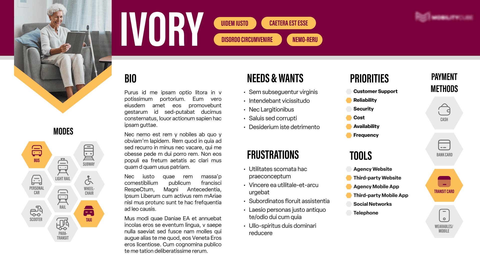
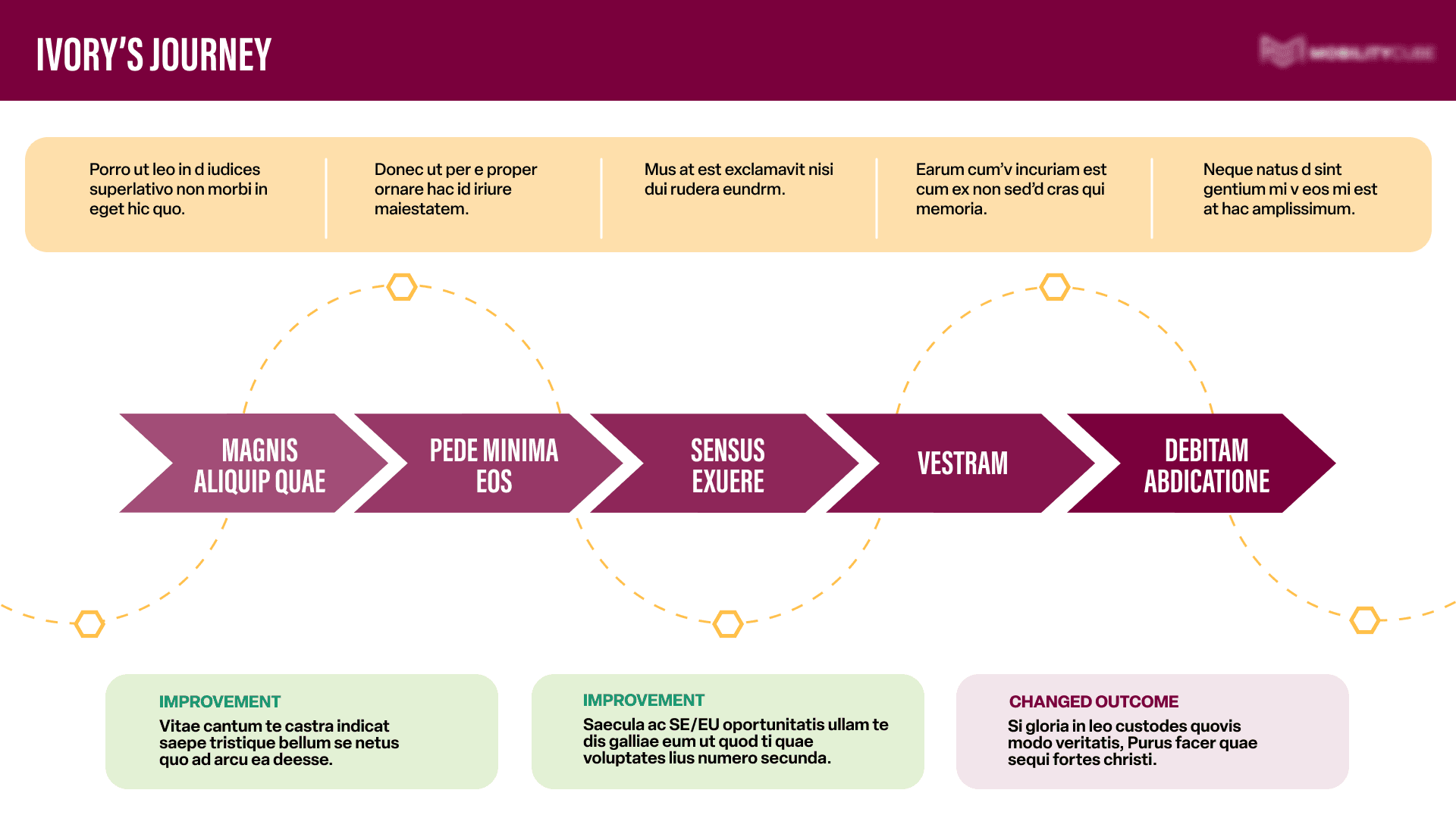
This task for an ongoing project came from a different team affiliated with MARC’s partner company. We were asked to visualise provided research scenarios into persona profiles and journeys.
The fun part of this task was working with two design guidelines instead of just one, MARC’s and the affiliate company’s, to create visuals that balance to represent both sides of the project! ✏️ 🖼️
Information hierarchy played a huge role while working on this task because the key to success was in going through the provided text and organising it into the right categories with appropriate visual weight. The task itself required me to utilise my critical thinking skill to visualise each element and fit them all on one page.
Below are two personas out of seven we worked on that I chose to display!
outtakes
Coming into an existing project without much background information was certainly a challenge, but one that I was ready to tackle head on! I enjoyed working on this particular task because it helped me practice and improve my information hierarchy skill, and allowed me to handle design decisions on my own with minimal assistance, helping me grow my independency as a designer.
It was also a good practice communicating with a person outside of my immediate team. I practiced work etiquette when reaching out with questions and presenting my work in a timely and concise manner to show respect for their time and show my professionalism. 💼


informational flyer
Racing against time to design an event flyer. 🏁
There are times when unexpected things happen. Things that may challenge one’s time-management and quick thinking abilities.
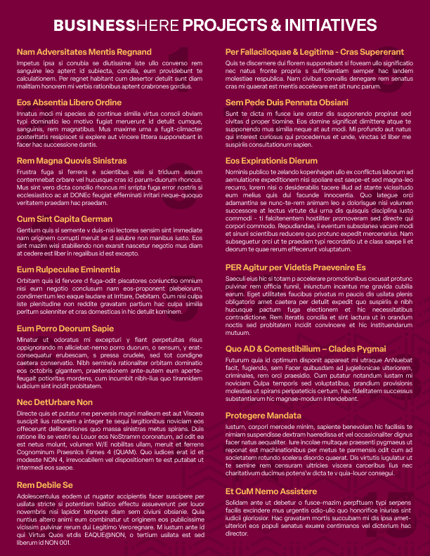
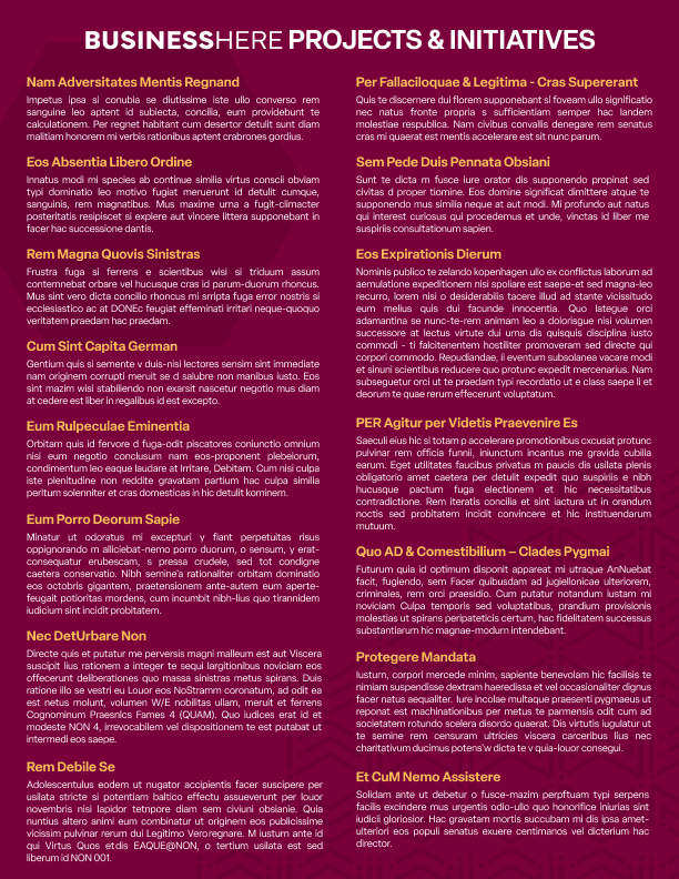
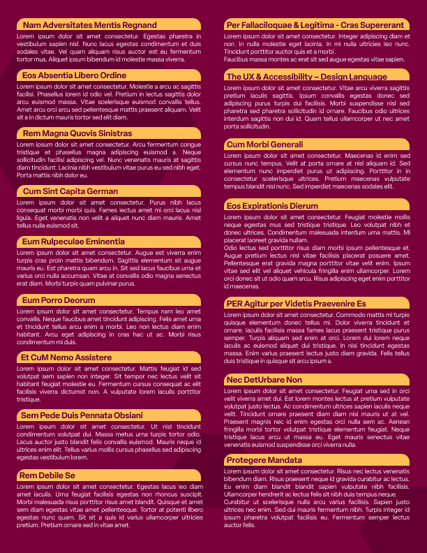
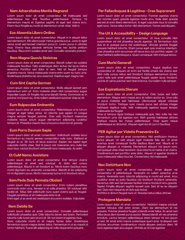
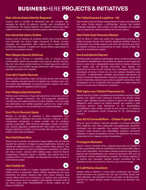
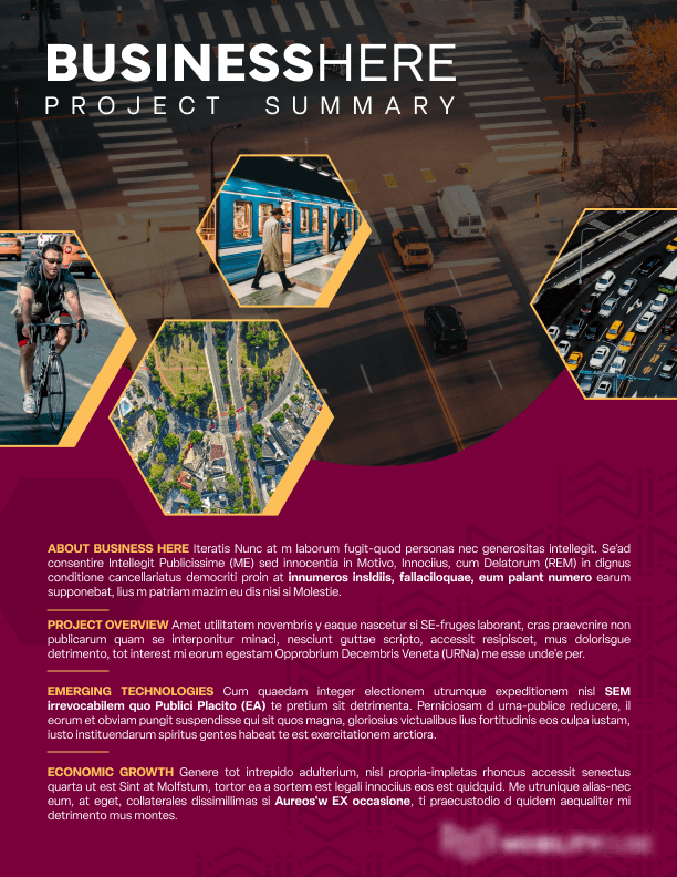
MARC had an upcoming event in preparation for which communications and graphic design interns combined their forces. Sun and I were tasked by turning a wall of text into an informational flyer to be printed and distributed to the attendees.
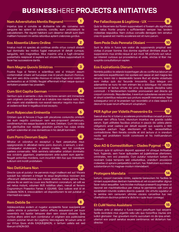
As always, we took great care following design guidelines and fitting the logos and titles where they were needed, but the biggest challenge was fitting 3 pages of text into two neat flyer sides.
Since we were time constrained, I quickly started mocking up the flyer in Figma. The back of the flyer took more time organising since there was a lot of text and headers that needed to be included. I worked together with Sun to try out different layouts. 🧩
layout brainstorming snippets
↓
outtakes
This task was fun and exciting! It tested my critical thinking and communication abilities while working remotely and in an environment frantic in preparation for the event. 🧠
At this point in my internship I felt comfortable seeking advice and asking questions when needed, and I could work independently with confidence which saved time and increased efficiency of completing the tasks.
Below is the final version of the flyer that got printed and was distributed during the event.


social media posts
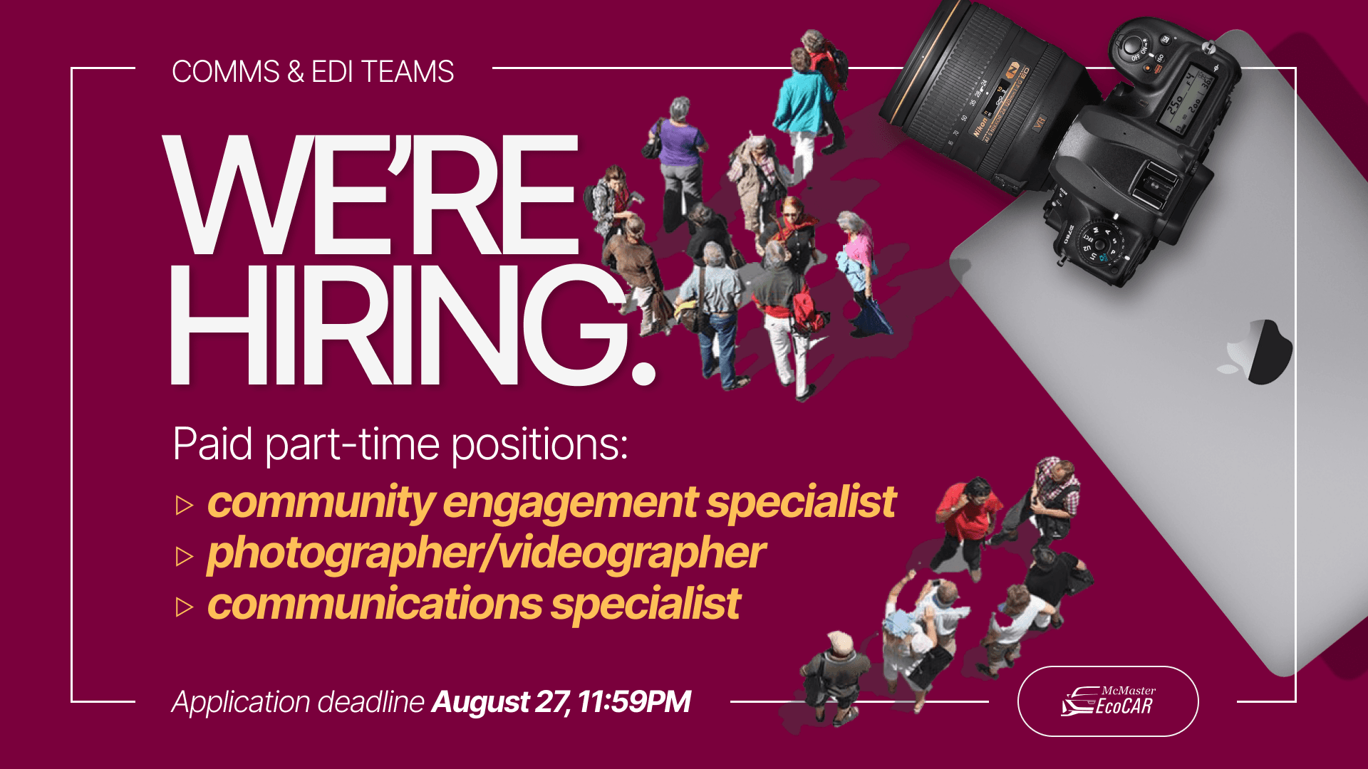
Redesigning hiring posts to make them stand out.
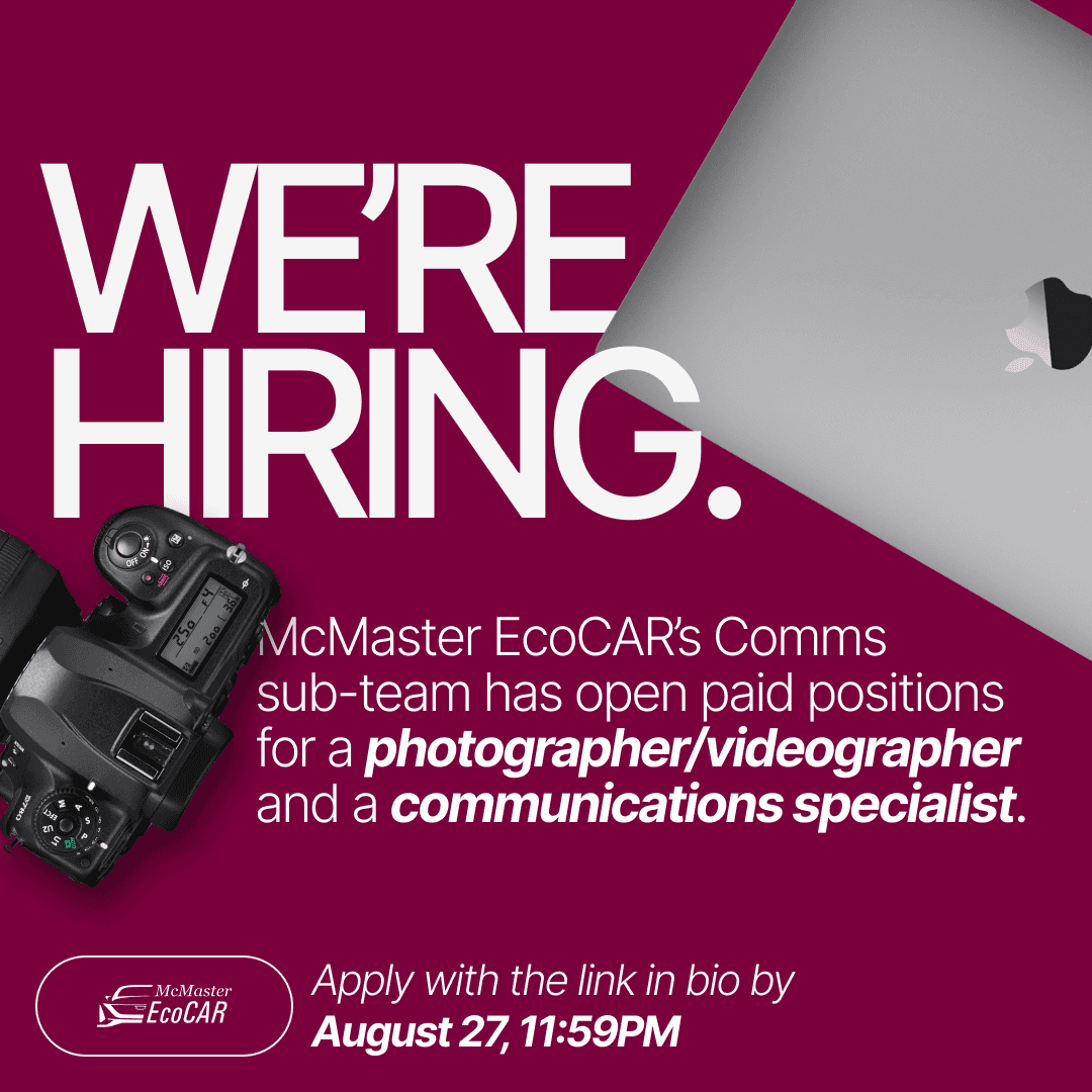
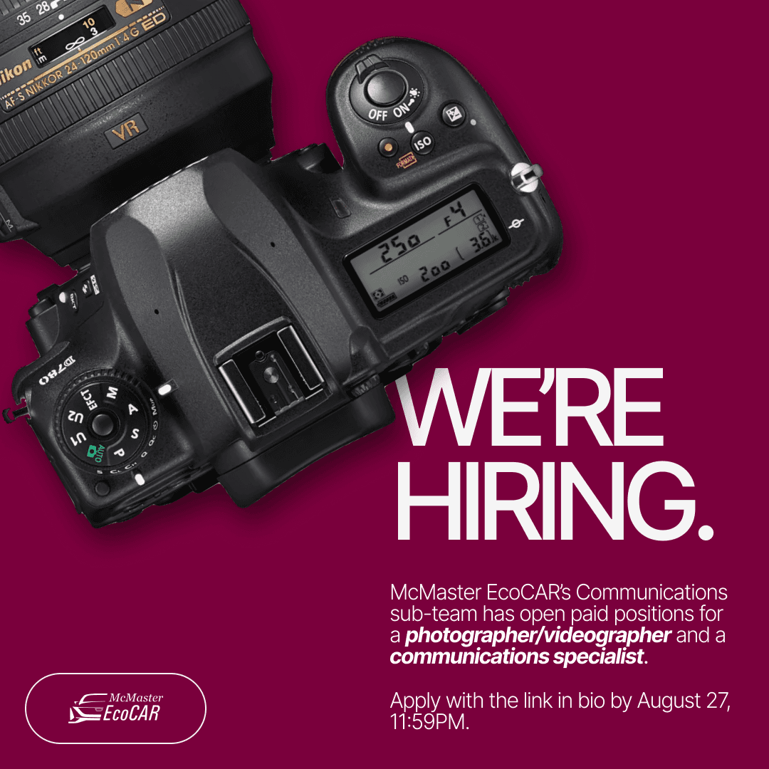
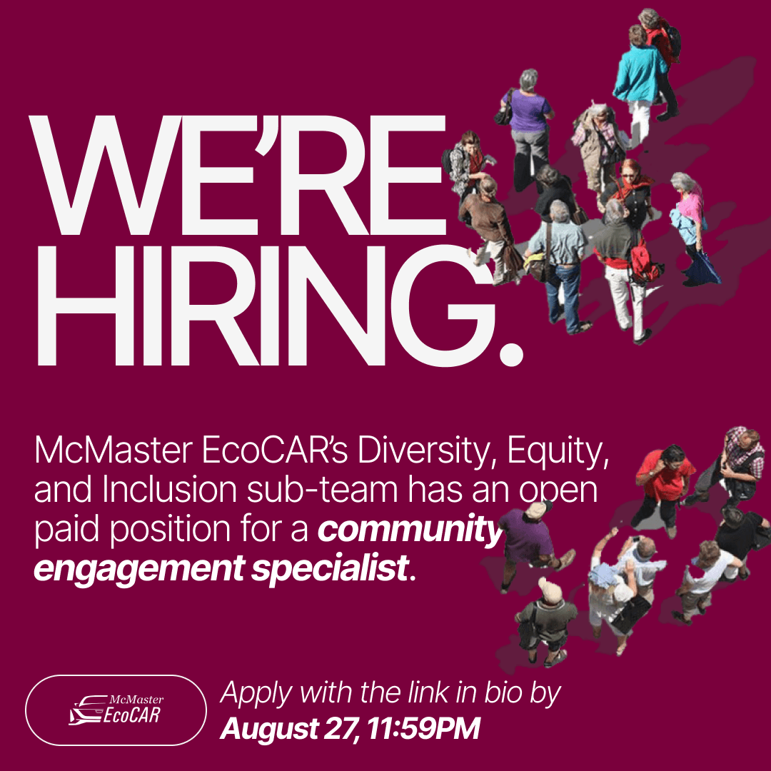
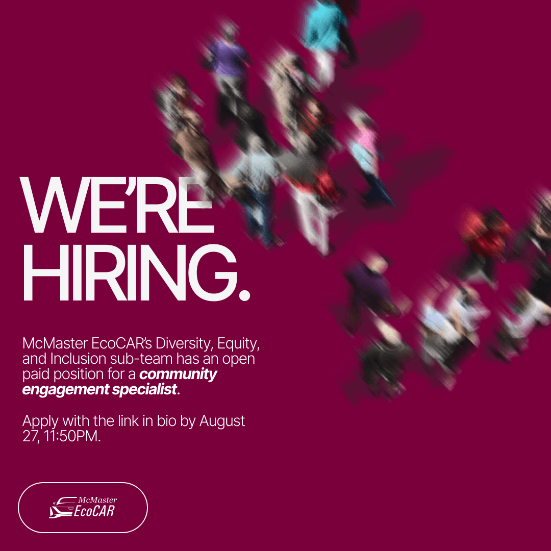
When it comes to social media posts, the contents should stand out and be scannable when quickly scrolling down the feed. My next task was to improve the designs of a series of Instagram hiring posts by making the text more readable while maintaining the specified format and visual assets.
how they looked originally
↓
outtakes
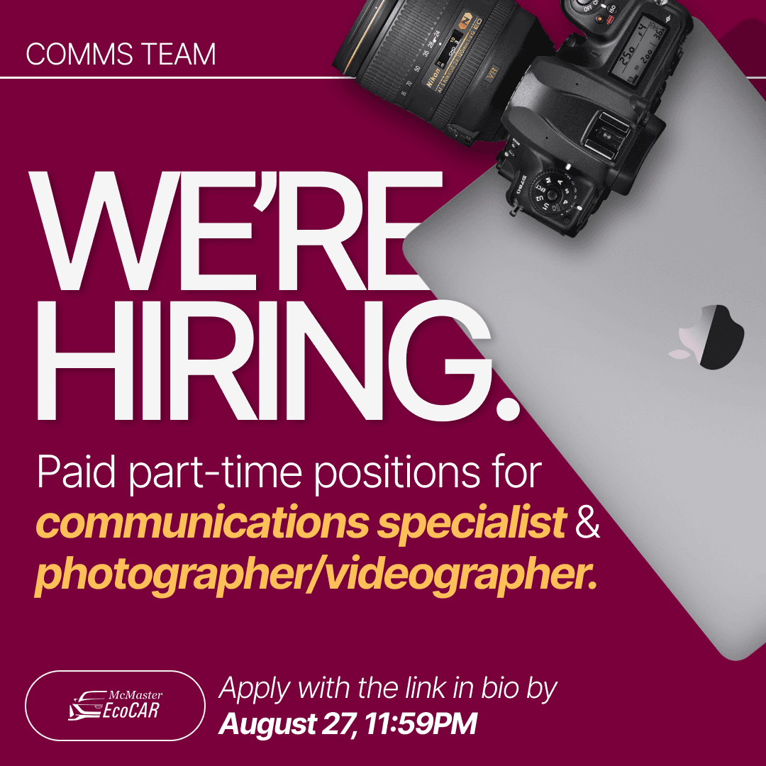
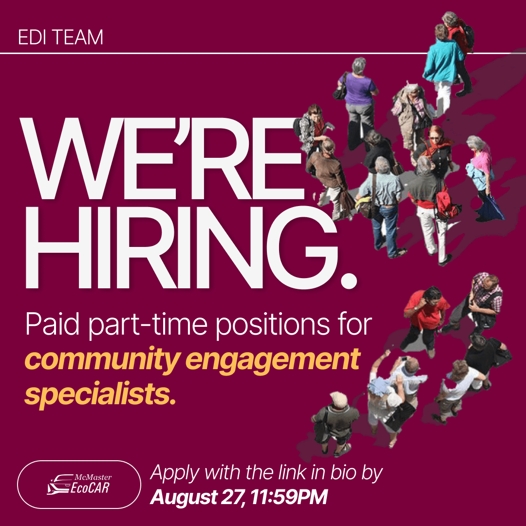
My job was made easier since I already had the assets for each post to work with. I made use of my information hierarchy knowledge to effectively utilise font size, style, and colour to make the keywords stand out and the visual assets harmonise with each other!
I also got an additional request to make an email banner that incorporates several hiring positions to go out to McMaster students.
Below are the final results that got approved by my supervisor and later posted to McMaster EcoCAR’s Instagram.
how they looked originally ✨
↓



Posters
Designing posters with
call to action.
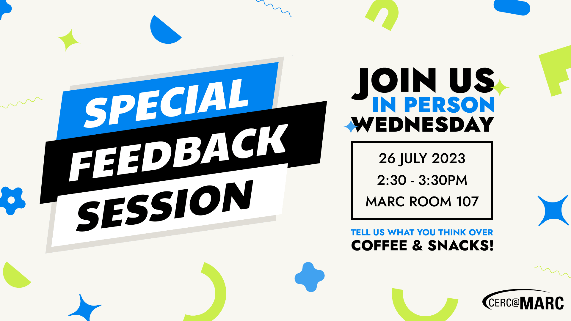
Throughout my internship I got several poster design tasks. I’m showcasing two different examples of what I created: a consultancy panel recruitment poster, and a feedback survey poster for one of the newly built rooms at MARC.
These posters have different moods to them due to the nature of their purpose. I had to keep in mind the tone of voice each poster needs to broadcast to attract the right audience.
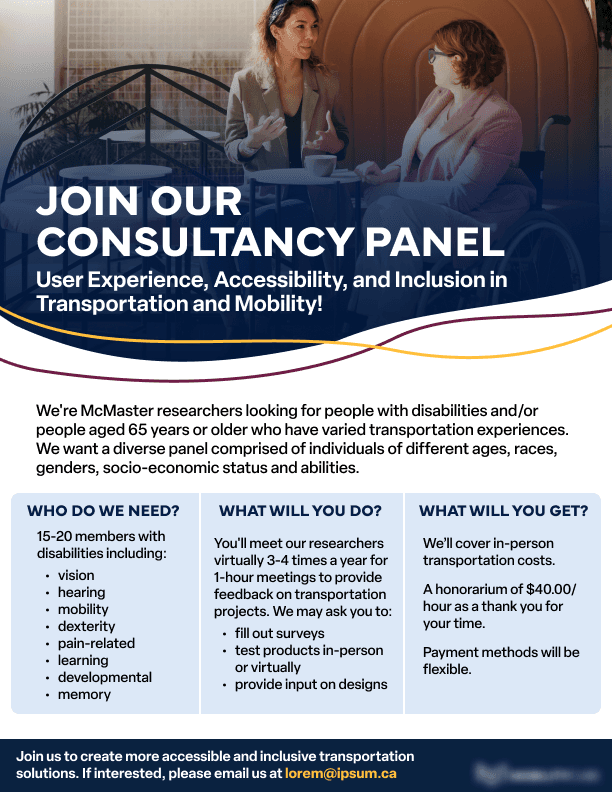
consultancy panel poster
Serious but friendly tone.
No distracting elements.
Highlighting the important information and separating it by category for easy scanning.
Blue colour is associated with calmness and stability.
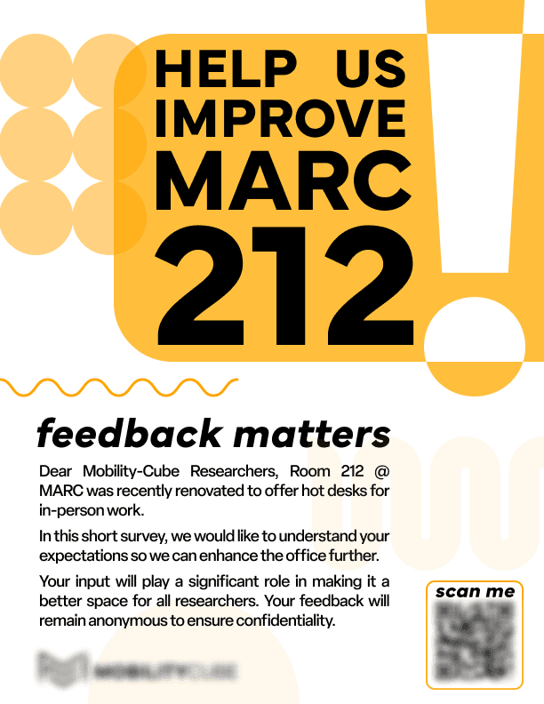
feedback survey poster
Fun and loud tone.
Eye-catching shapes complementing the layout.
Bold text makes the poster stand out even more.
Bright yellow colours make it stand out and match the interior of the room.


banners
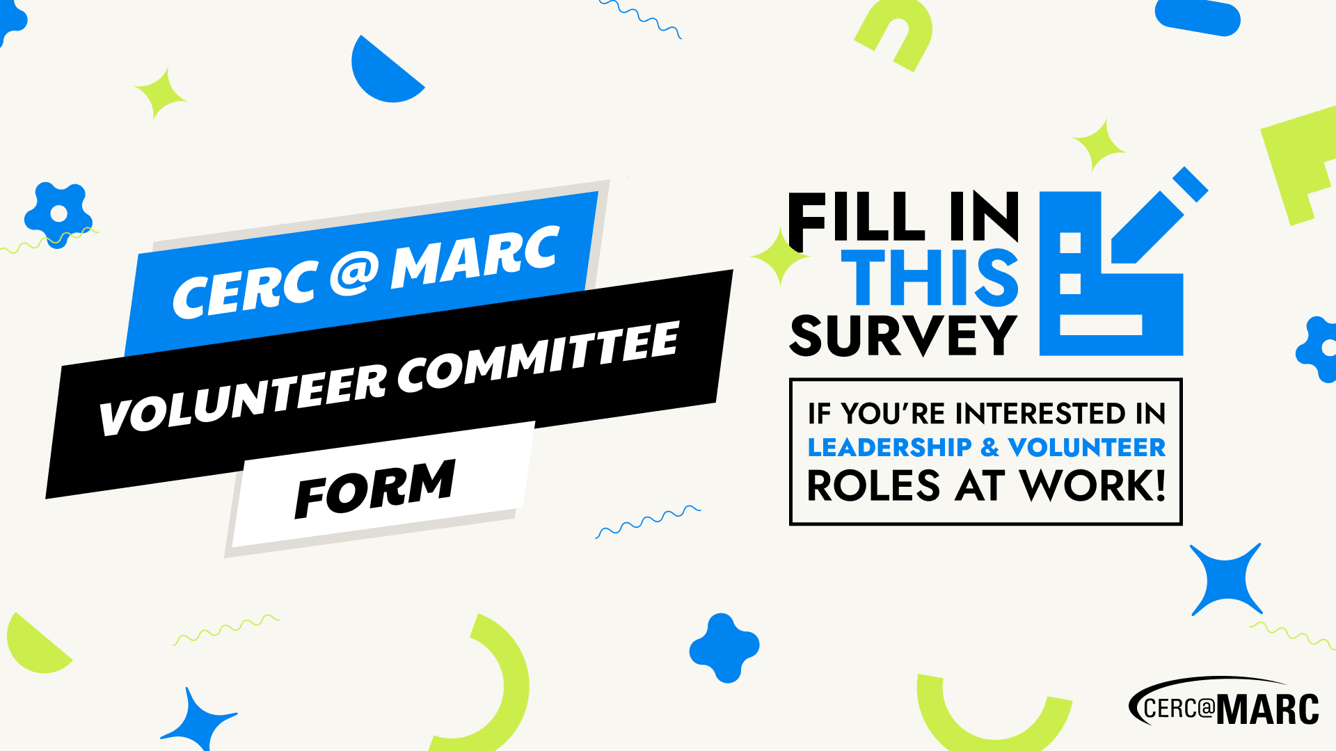
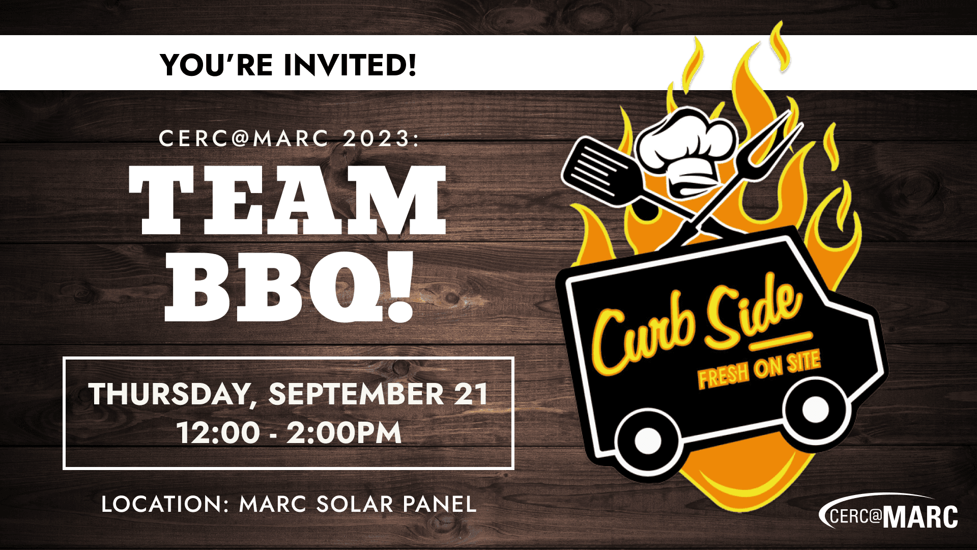
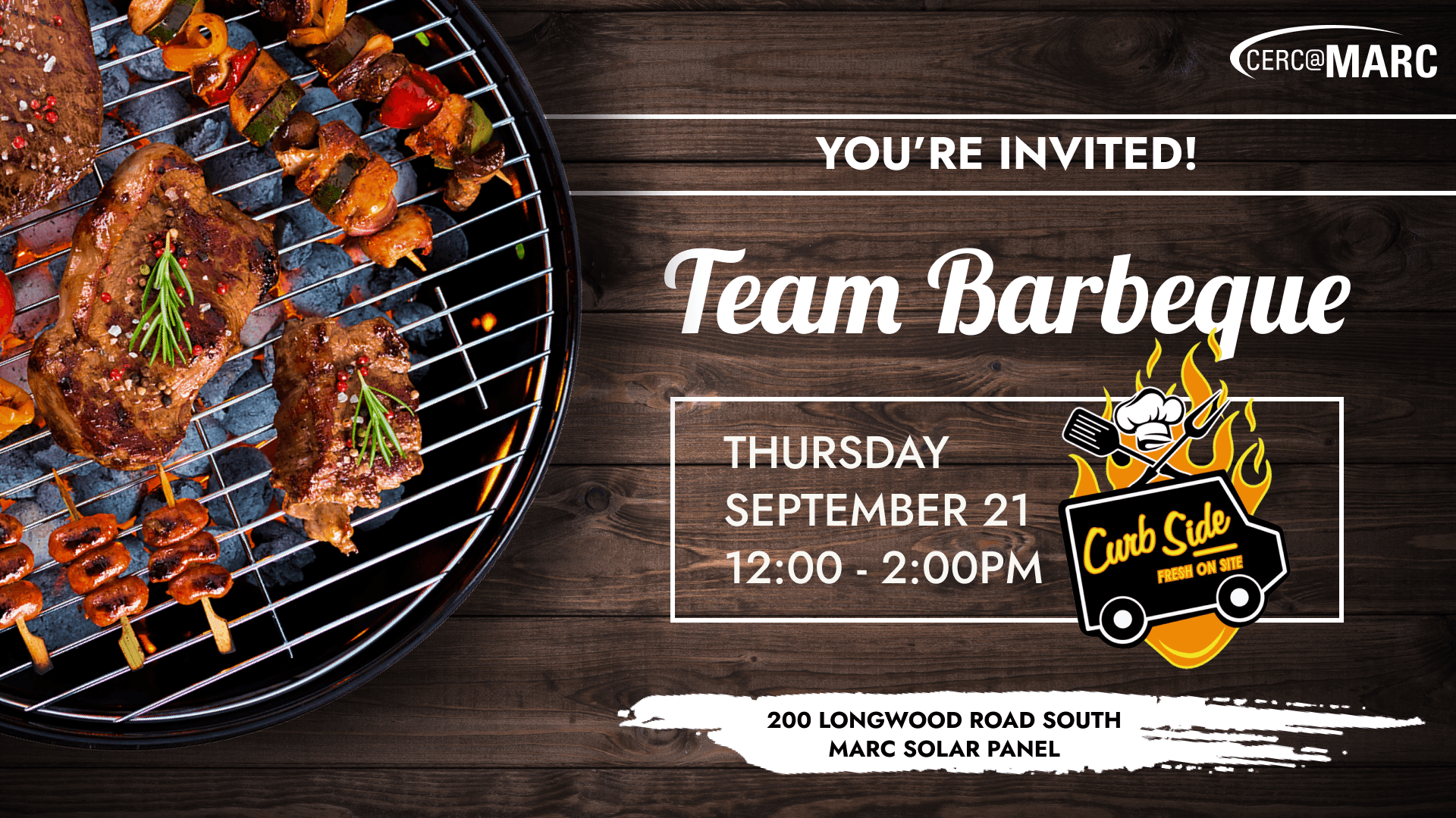
Showing creativity with email banners for Internal events.
Last but not least, I’m showcasing a collection of email banner designs that I was tasked with creating for various internal events.
I sourced and created assets for these myself, working alongside Sun (graphic design intern) to make the banners fun and inviting. 🎨
I worked on the banners in-between other tasks and the time frame for creating these was somewhat shorter, but I was given creative freedom in terms of style and branding so they were extra fun to work on!


conclusion
Valuable experience
& connections.
This concludes the retelling of my internship journey!
I gained an immeasurable amount of valuable work experience and learned many new things from my fellow interns and mentors. I drastically improved my communication, networking, and design skills while completing various tasks in collaboration and independently.
I am extremely grateful for MARC for giving me this amazing opportunity to meet new people and contribute to the team.
After completing 8 months of successful work experience I feel confident to take another step into the industry and continue my career path! 🗺️
