Gifti.
A technology spin on tradition that makes gifting even better! 🎁
my role.
Interaction Designer
team.
Vivi Sim (me!)
tools.
Blender
Meta Spark Studio
Figma
Procreate
Adobe Illustrator
Adobe Premiere Pro
timeline.
8 months
overview
Make gifting more special.
How might we reduce paper waste and elevate gifting experience by introducing fabric wrapping with personalised augmented reality experience?
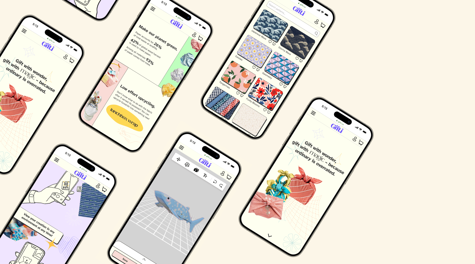
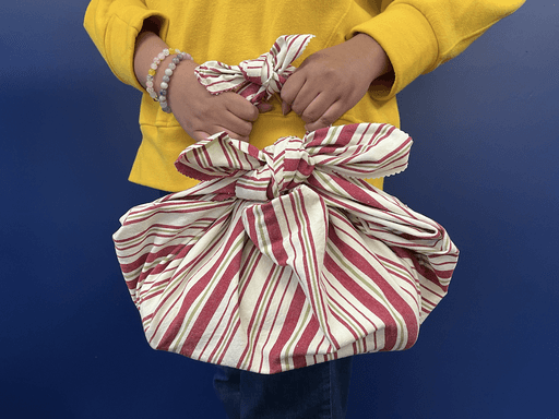
Gifti is a self-made business concept where people can purchase beautiful furoshiki to use for gift wrapping. Its mobile webpage features an in-built 3D editor that allows users to customise a unique AR experience catered to the recipient of the gift. It can be viewed by simply scanning a QR code that is unique to each individual fabric purchased or owned.
The final product is my take on furoshiki, traditional Japanese cloths used for carrying goods, with an Augmented Reality (AR) elevated experience that brings extra joy and magic to making and giving gifts to loved ones. 🎁
This case study goes over my 2-semester-long journey of developing and bringing to life a design intervention concept that aims to solve the world problem of paper waste. ♻️
Challenge
An opportunity for
design intervention.
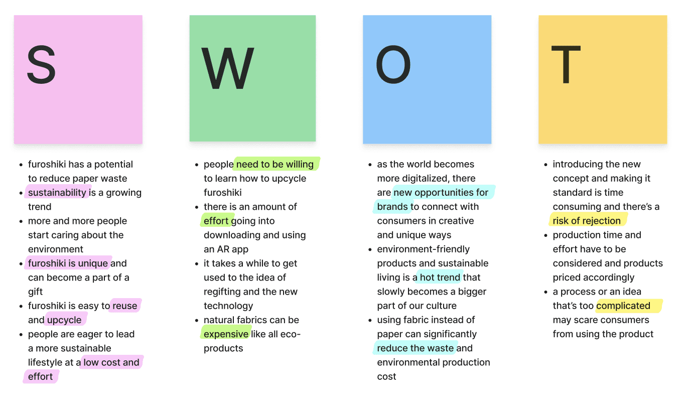
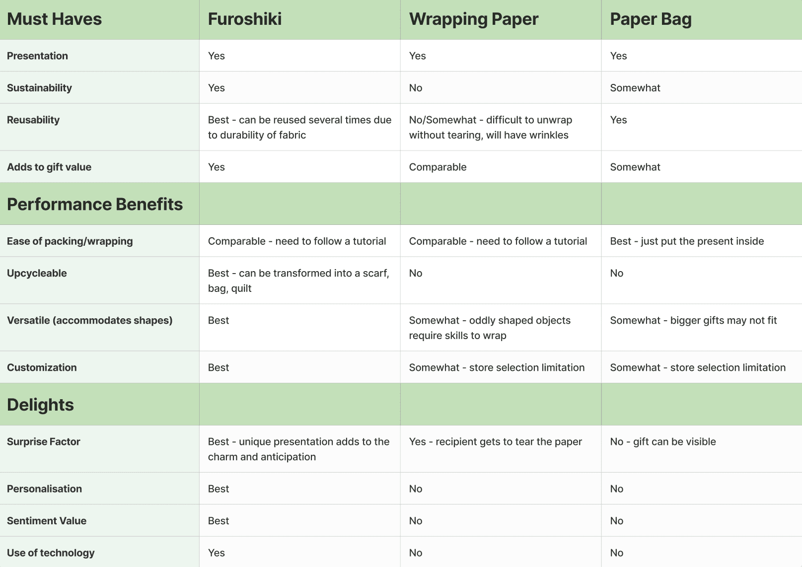
Sustainability is a now popular trend that more companies are trying to incorporate in their products. Paper waste is one of the most common ecological issues, and packaging makes up for one third or more of our trash. Using fabric that can be reused and upcycled is a great and stylish alternative!
Product experience can be elevated via personalisation. Preliminary user interviews and peer feedback showed that most people would feel touched if presentation of a gift was more personal. 🌟
Use of technologies such as Augmented Reality got positive feedback from the users. They are willing and curious to experience receiving a present with a personalised digital element. 💡
solution
Enhancing sustainable gifting with Augmented Reality.
Gifti became one of my proudest and favourite projects to date. I applied the design skills acquired over the four years of my undergrad by conducting user research, planning the schedule and risk management for the project, prototyping, and navigating each sprint of the two-semester long timeline by following the double diamond design process: discover, define, develop, deliver.
The journey was full of pivoting, learning new skills, and improving myself as a designer readying for the first steps in my future career!
sprint one
Research & user testing.
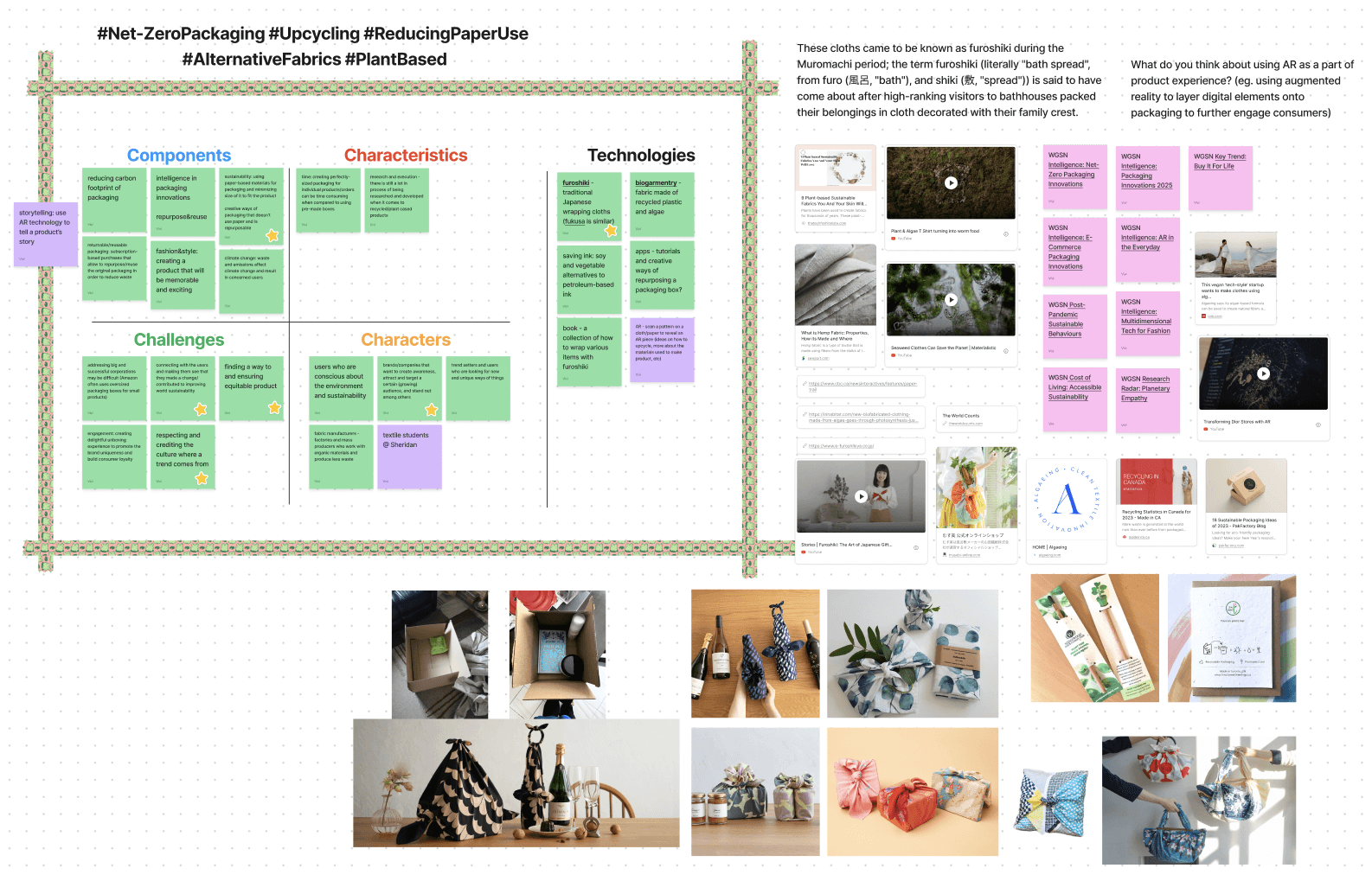
The first sprint of this project began with the research and justification of my chosen topic and area of opportunity. I assessed the personal biases and used several design research methods at this stage in order to seek out what are the user needs and wants, and to solidify my product idea. 🔎
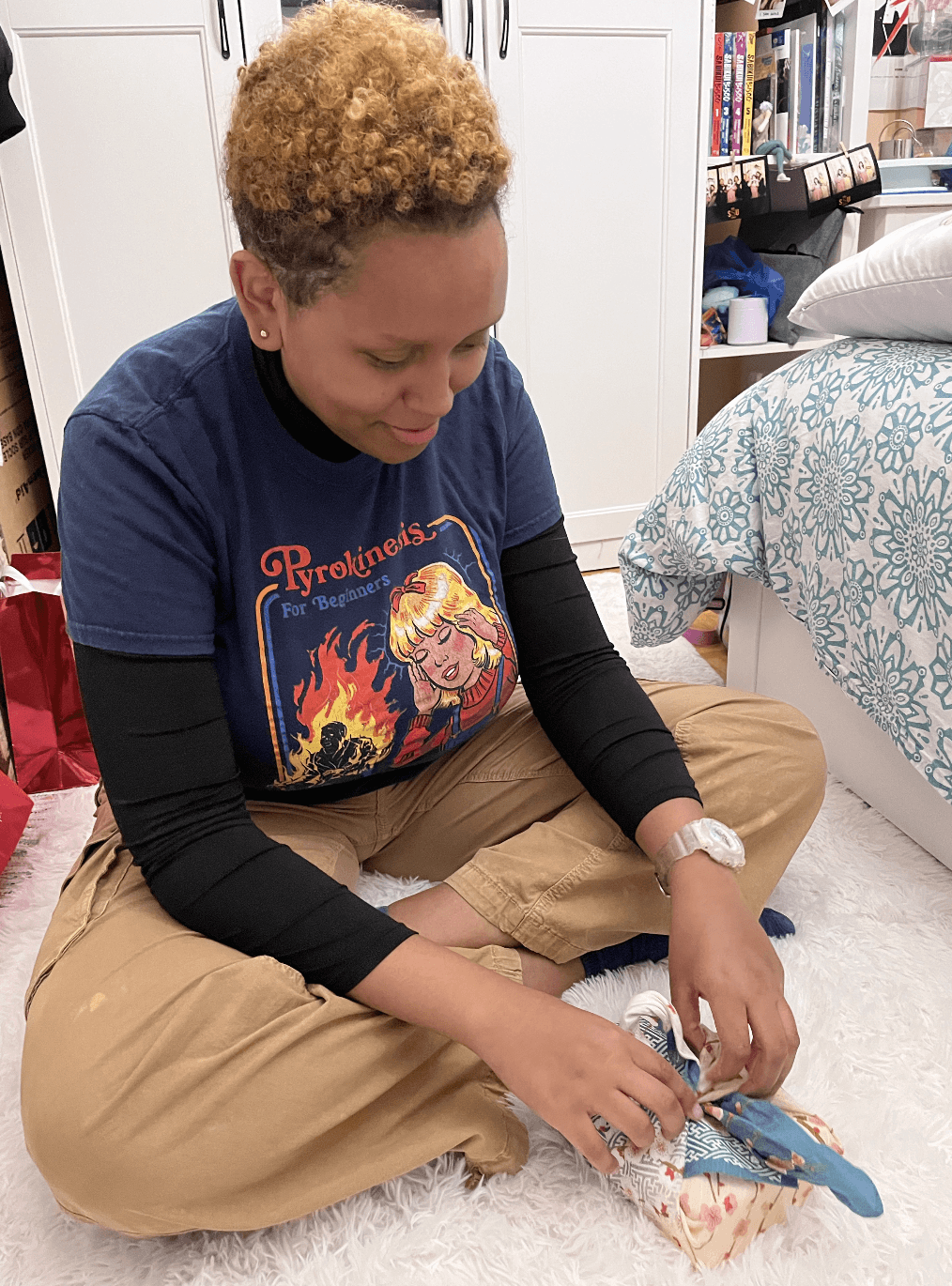
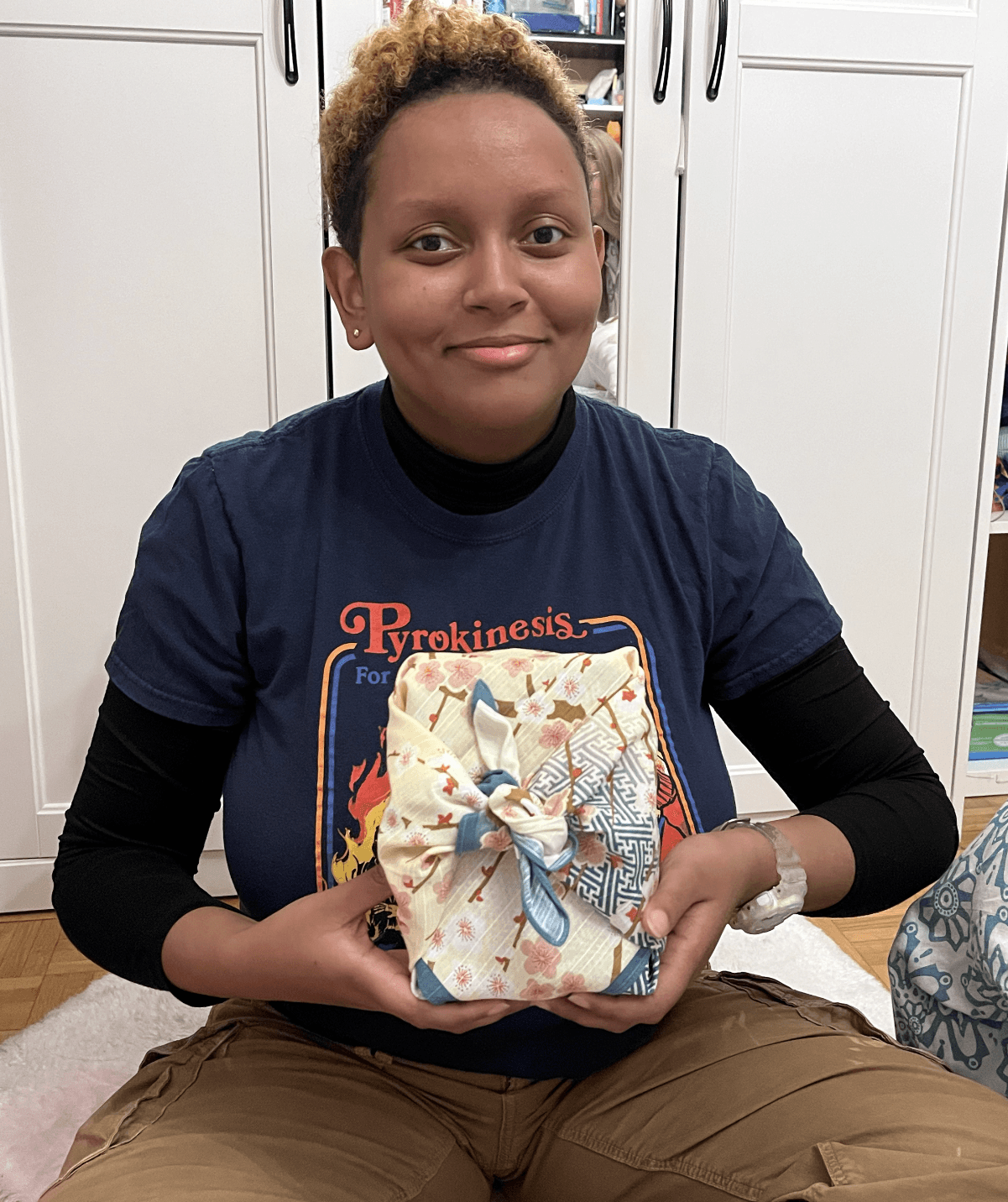
I conducted primary and secondary research before diving into preliminary user testing with props and scenarios!
outtakes
By the end of sprint one I had built a solid foundation of the product concept, with primary and secondary research to back my assumptions and fuel my inspiration! 🖼️
sprint two
Creative exploration & technology choices.
The first sprint of this project began with the research and justification of my chosen topic and area of opportunity. I assessed the personal biases and used several design research methods at this stage in order to seek out what are the user needs and wants, and to solidify my product idea. 🔎
I conducted primary and secondary research before diving into preliminary user testing with props and scenarios!
creative exploration
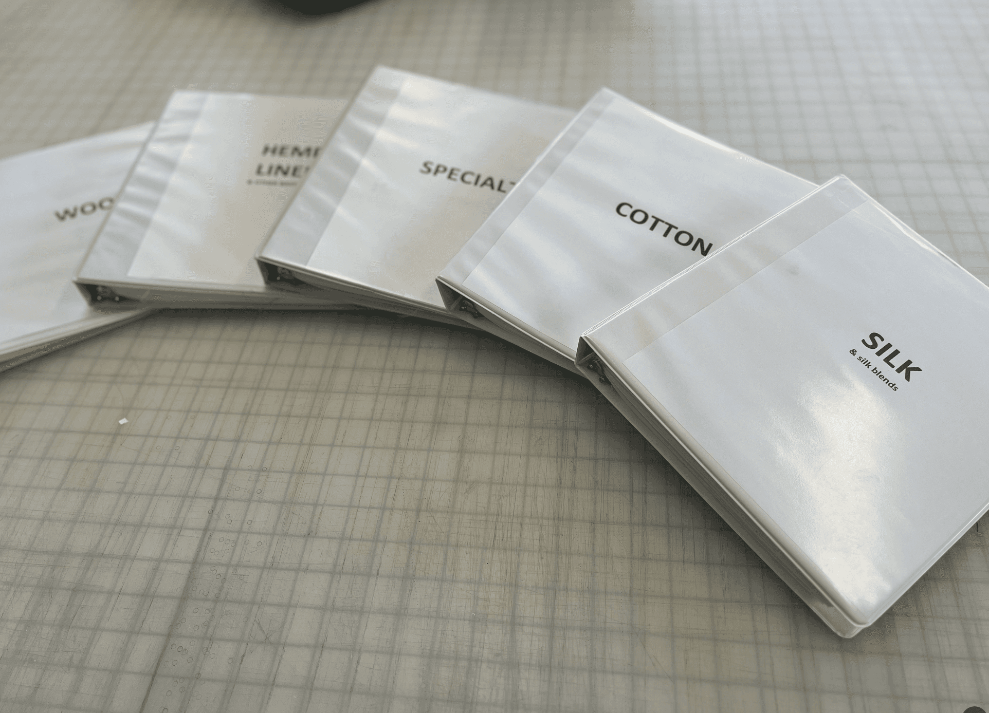
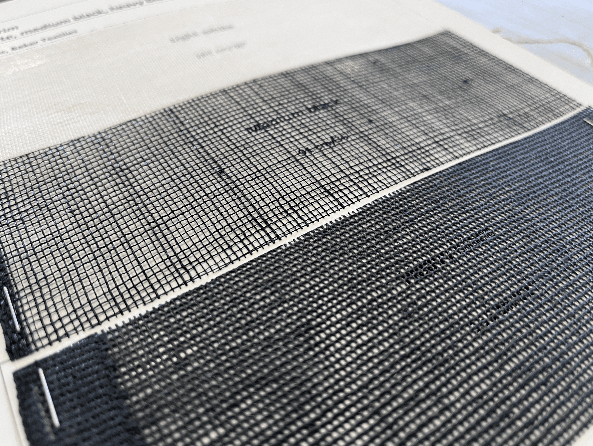
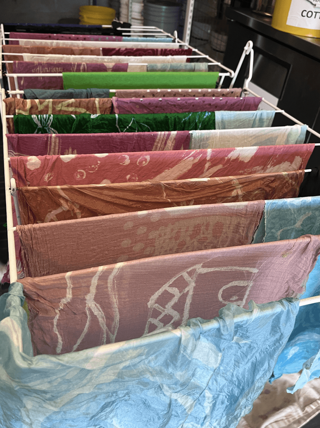
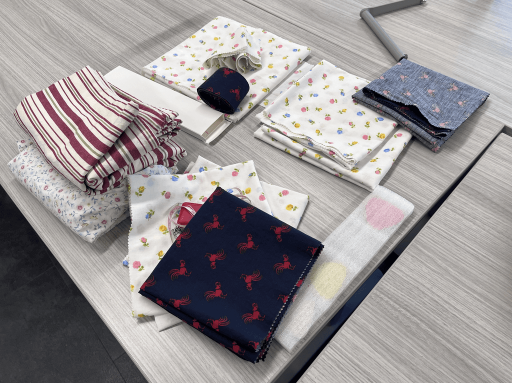
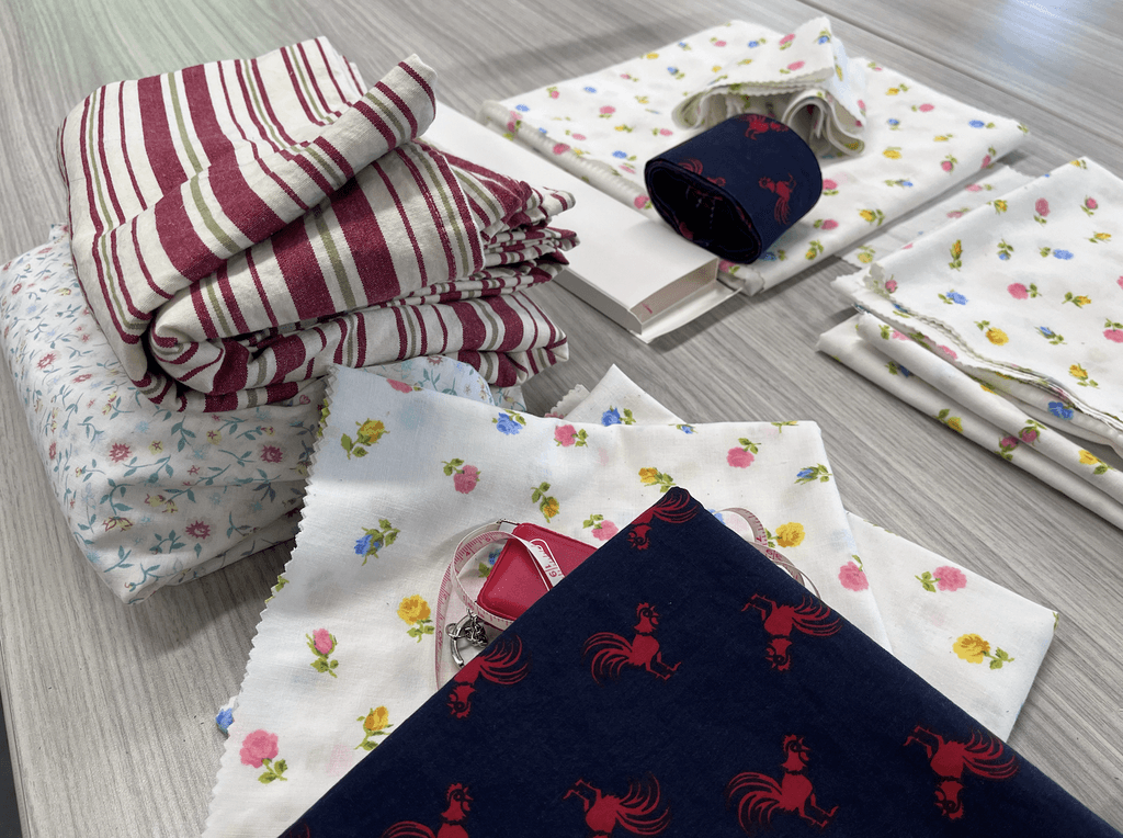
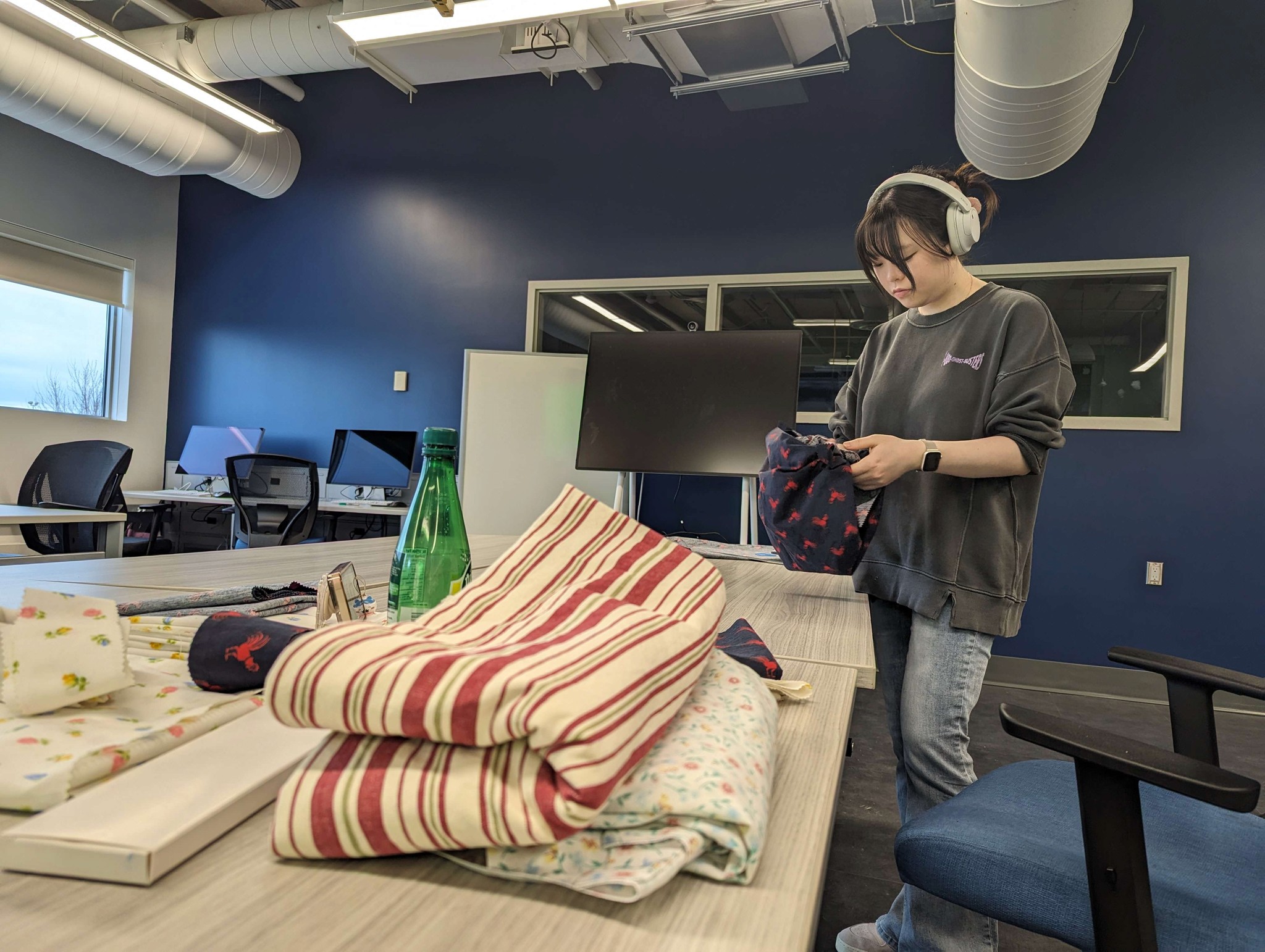
I reached out to a student from the textiles department and conducted a short interview which allowed me to learn about and feel the fabrics available in their studio’s catalogue. 🧶
It was a great experience to gain for my to have a better idea of what kinds of fabrics can be made into furoshiki and what their qualities are like. ✨
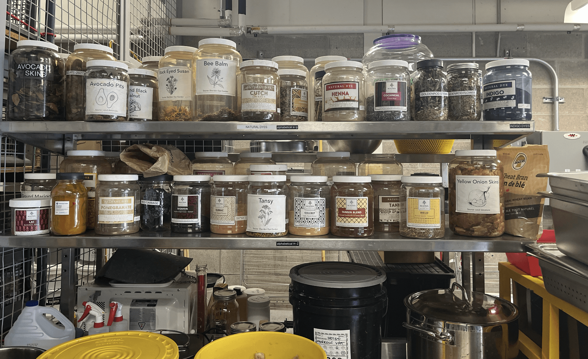
We discussed the psychology of colours with my interviewee since it was a part of her thesis project, a possibility of branching out for my own product at the later stages which can play into user experience.
user testing
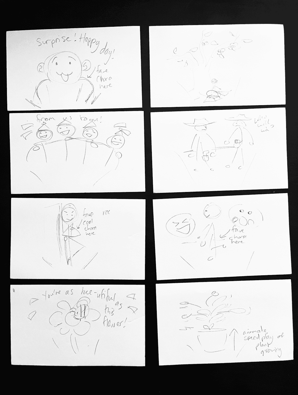
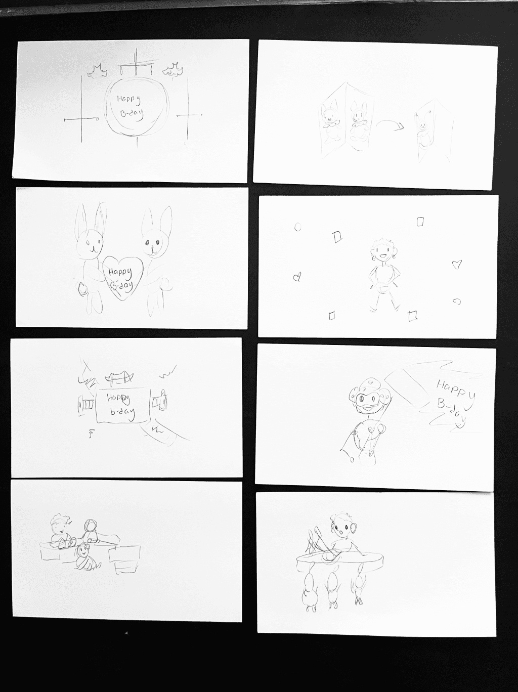
I conducted a crazy 8 activity in which the participants came up with eight gift ideas each. It’s a fast brainstorming activity that lasts for 8 minutes (1 minute per sketch) and allows for creative thinking and unique idea generation.
This test revealed that personal ideas based on memories and inside jokes are favourites, while more generic and simple ideas are nice but don’t feel like much effort and thought was put into them.
Additionally, after getting user feedback at the end of the activity, I learned that the gift makers are also having a lot of fun coming up with the ideas.
technologies
AR technology is one of the primary features of my product that is vital to have included in the prototype for user testing. Among the platforms that allow to upload and view original 3D objects in AR I narrowed down the selection to Overly App and Meta Spark AR.
Overly App is an app that allows users to view AR elements in various scenarios. It has an option of uploading your own assets and arranging them in a scene which can be viewed by scanning a generated QR code with a smartphone camera. User testing showed that unfortunately Android users have trouble viewing Overly’s AR.
Meta Spark is an app owned by Meta that allows to create AR experiences that can be viewed via Facebook and/or Instagram. Users would need to be logged in the respective app but the process runs smoother for both Apple and Android mobile devices!
outtakes
I put my efforts into ideating and testing out the technologies to aid me in the prototype building, as well as gathering user-generated ideas and further identifying all of the elements required for the prototype. 🧩
Taking these steps ensured that I have everything ready for the upcoming sprint in which my focus will be on building and testing out iterations of the product prototype on various levels of fidelity.
sprint three
Building the parts. 🧩
In sprint three I continued conducting user tests with the various parts that would become my prototype in the future sprints. My aim was to make sure all of the elements are ready to be assembled into a functioning prototype by the next sprint for the final rounds of refinements and user testing!
One of my main tasks was to learn how to use Blender, a 3D graphics software, to create my own assets for the high-fidelity prototype, which ended up being a fun and challenging experience!
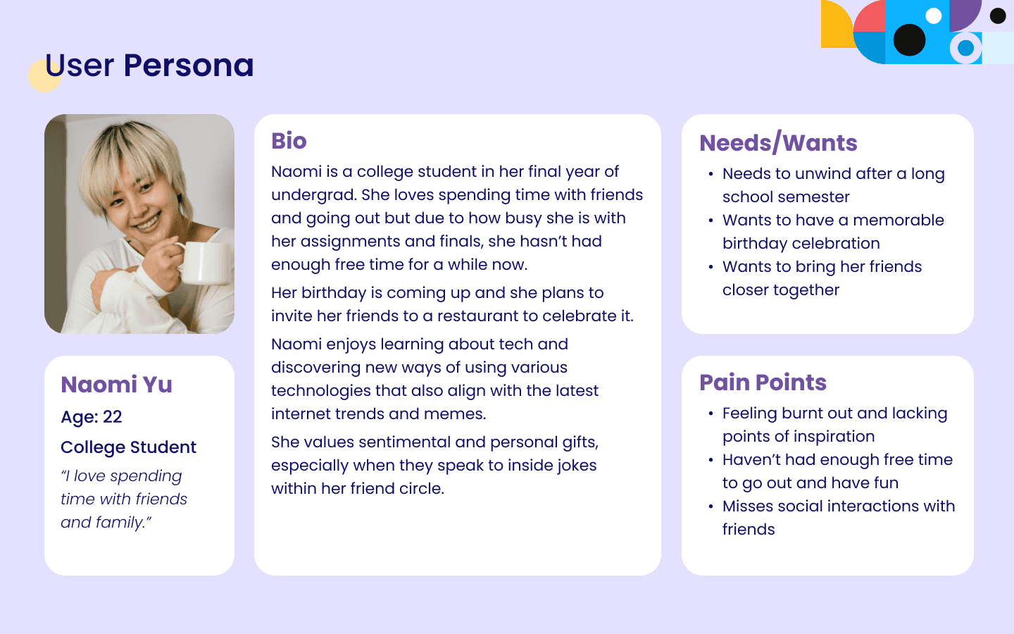
user persona
After analysing the data from the research, I refined the user responses and observations into a persona sheet that reflects the target audience of the product. 🧑
I took into consideration all of the insight from the previous sprints and focused on defining a person who would be the recipient of a gift.
making 3d assets
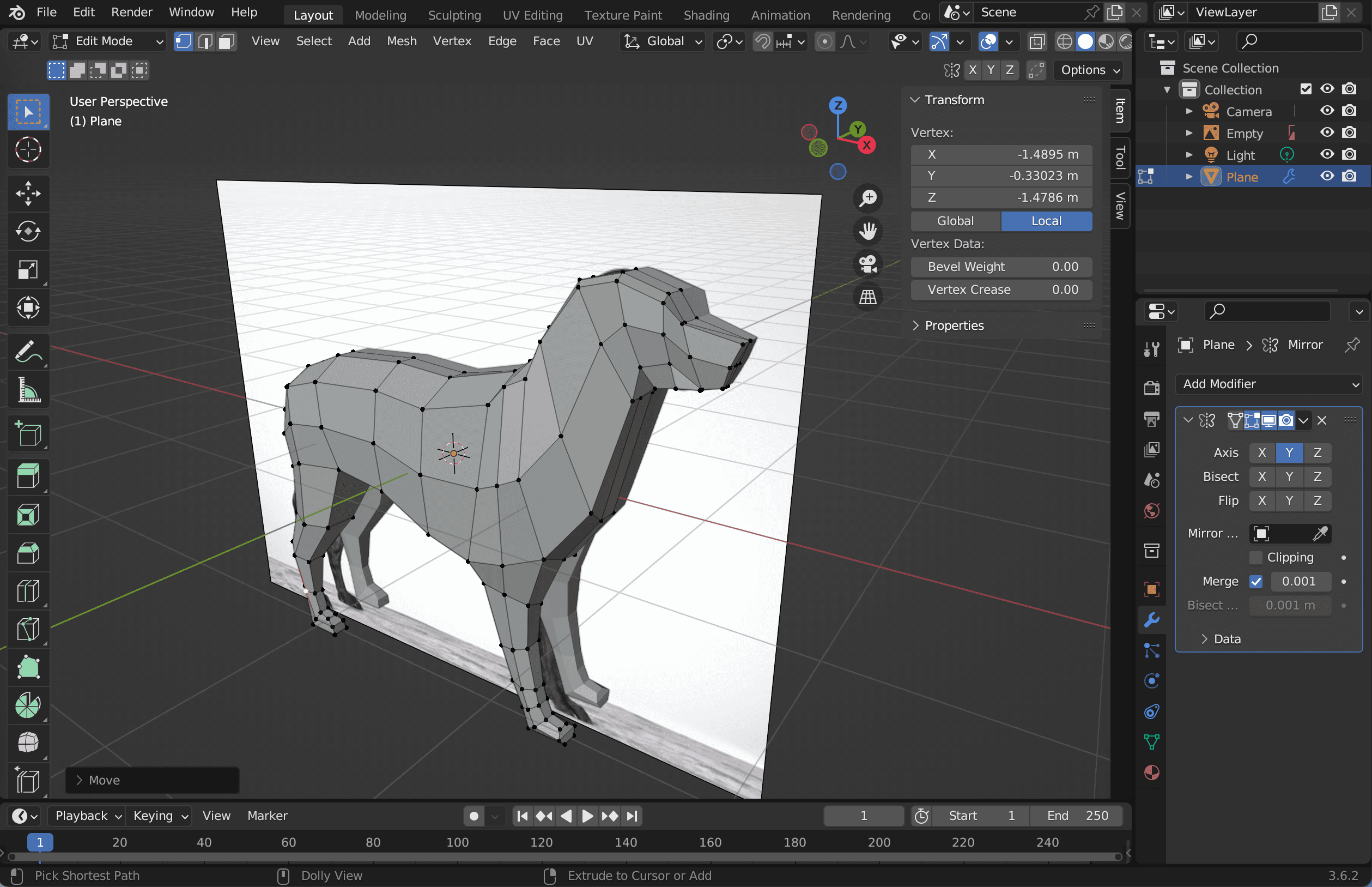
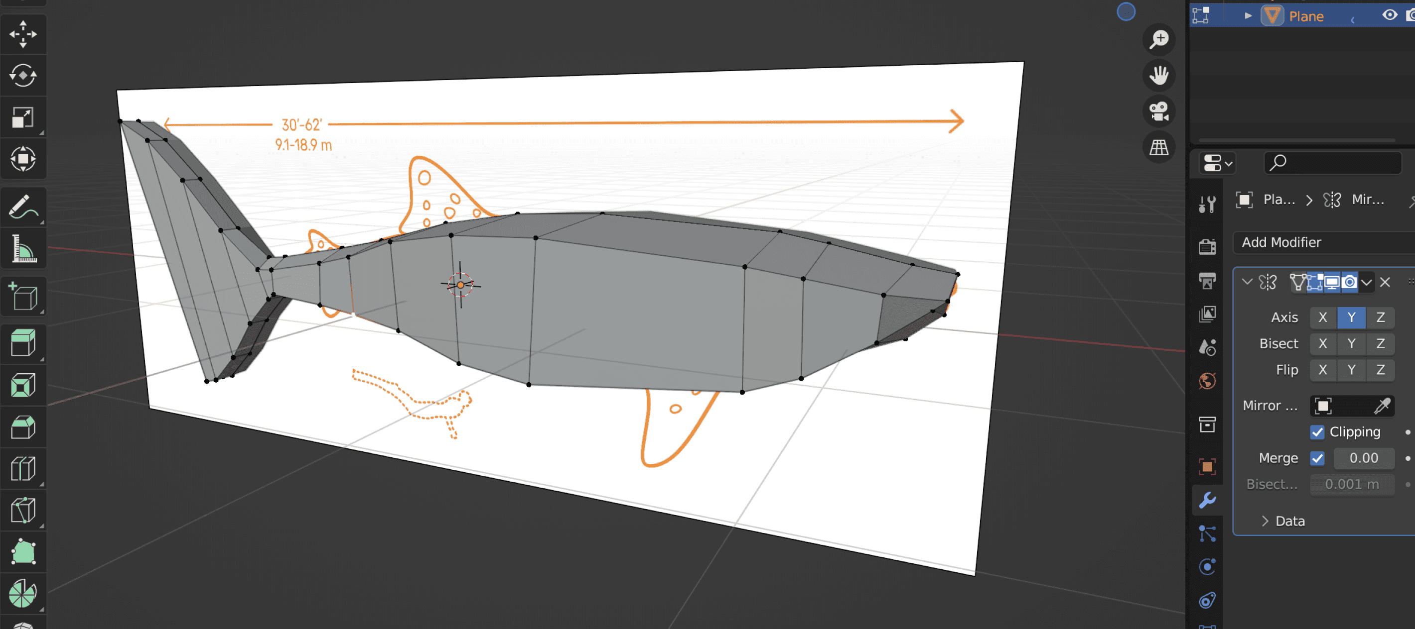
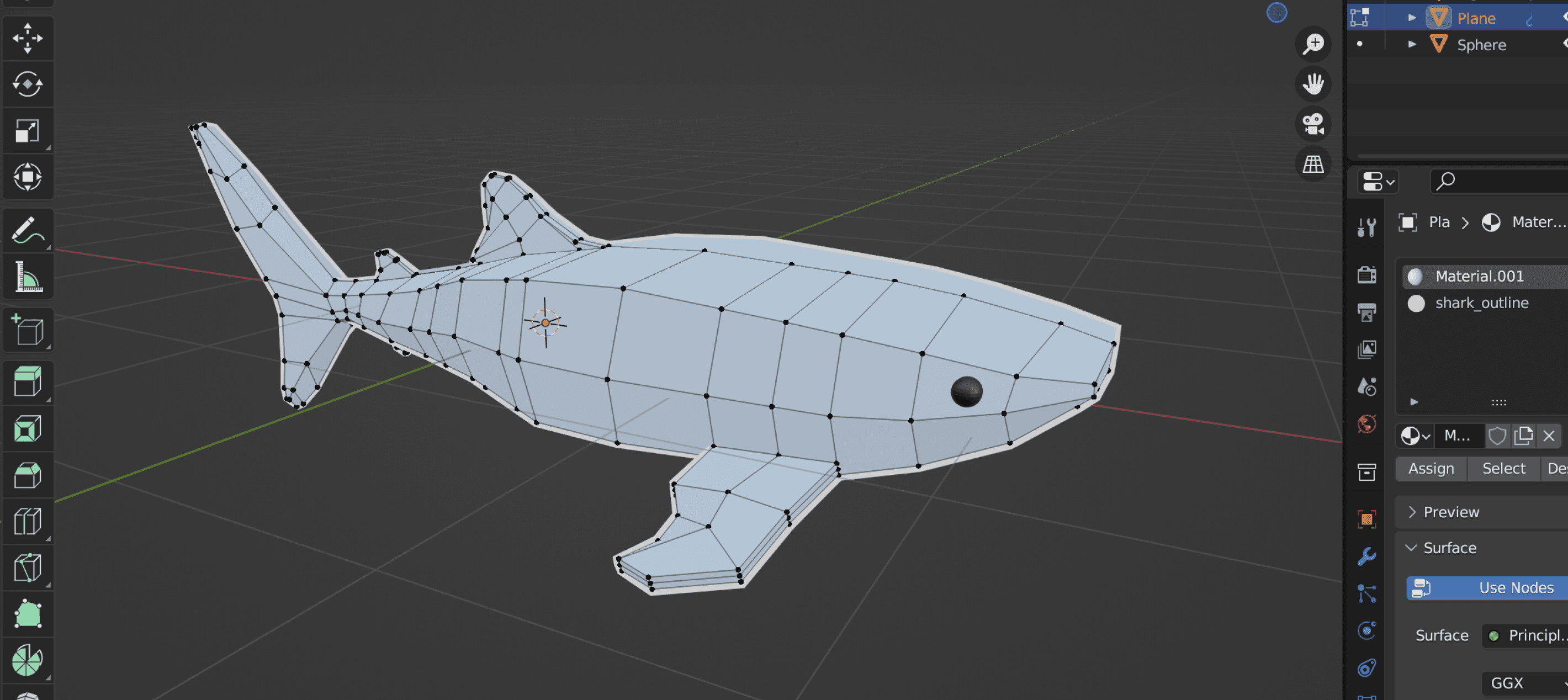
A significant hurdle in my thesis project journey was self-learning Blender to create 3D models from the ground up. Despite the steep learning curve, I was enthusiastic about facing the challenge. 🛠️
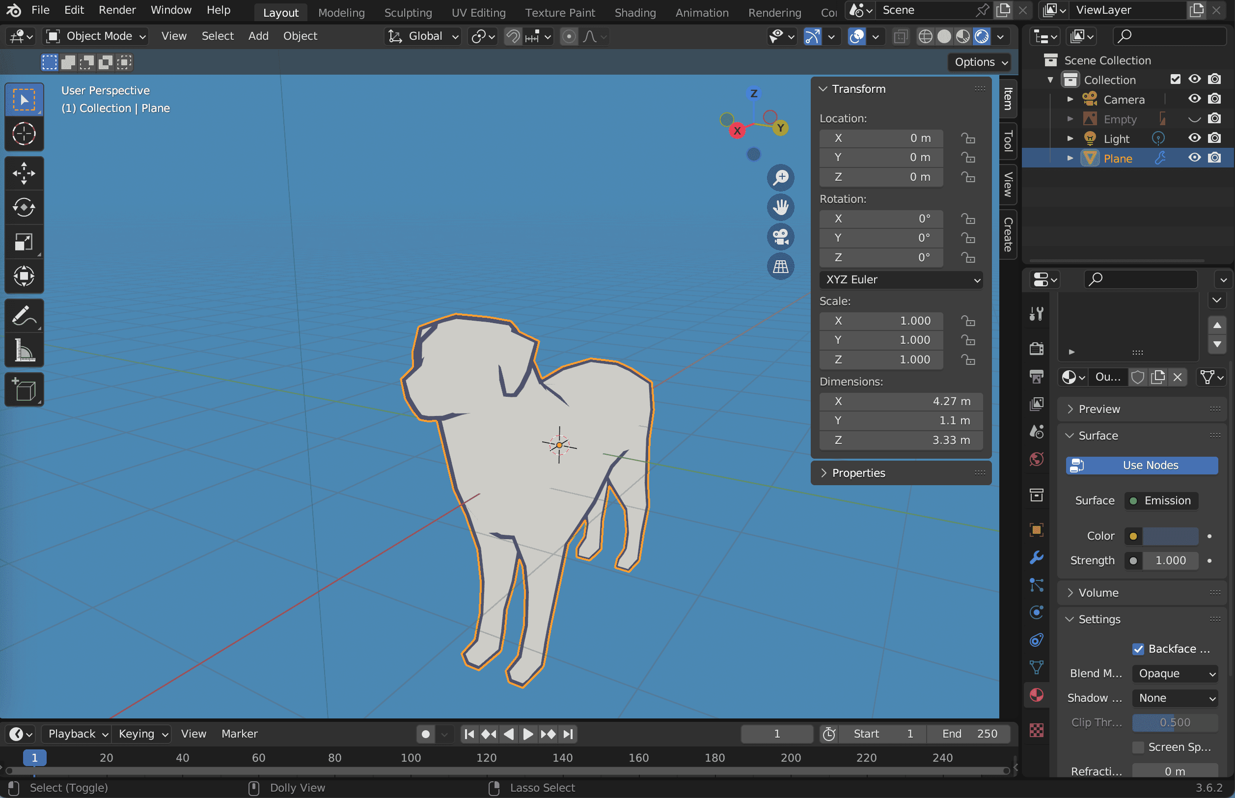
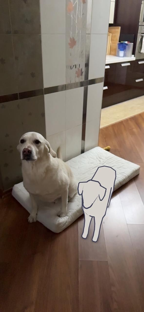
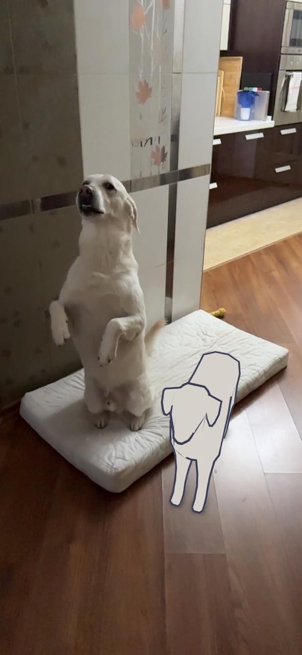
I practiced first by creating a figure inspired by my dog named Makoto! Once I mastered the fundamentals I decided to build an AR aquarium for people to view and interact with! Such experience would leave a lasting impression and be exciting and pretty to look at via a smartphone device. 🤳
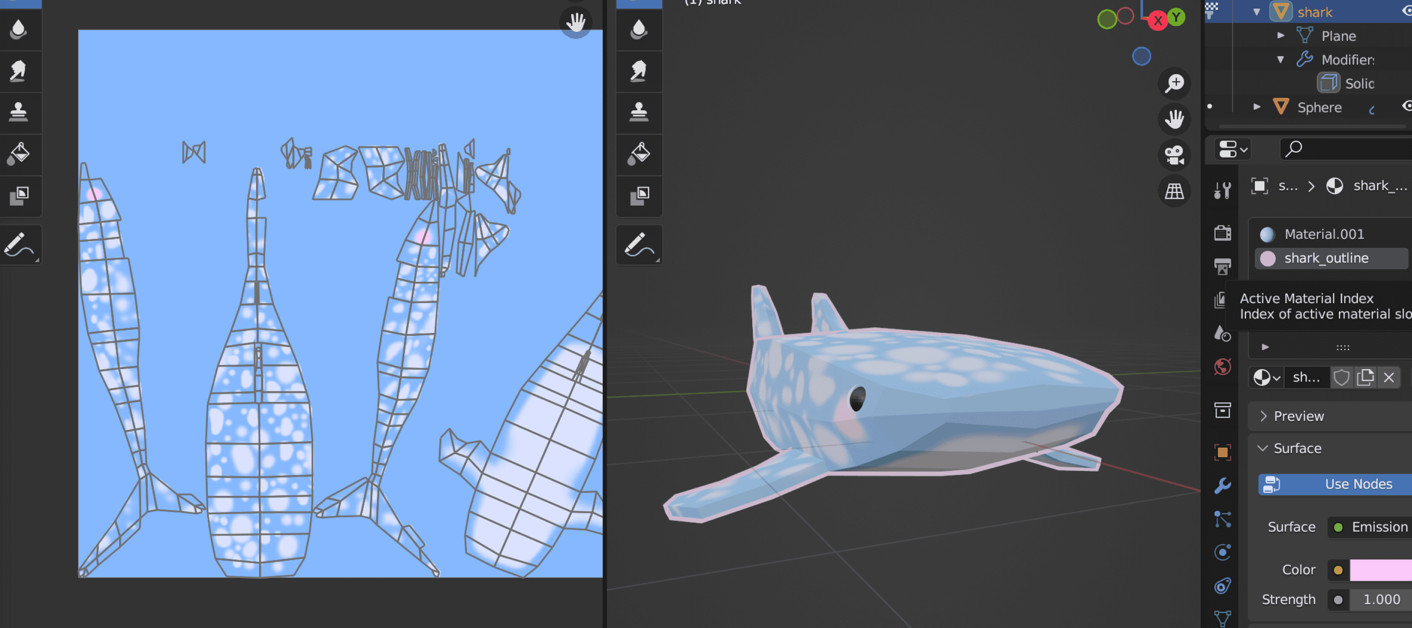
By applying new texture and armature animation skills I created 3D assets consisting of several different fish species to liven up the future AR aquarium space! 🐳
Overly App test
The first choice platform was originally Overly App, which worked great for uploading my own 3D asset and making in viewable for anyone who has access to a QR code.
However, when testing it for usability, Android users encountered issues viewing the scene natively. Users generally expressed their reluctance in downloading an external app so I decided to test out my next iteration in Meta Spark AR since it makes augmented reality viewable via Instagram and/or Facebook.
P.S. My family was thrilled to see what I’m working on and took some adorable photos of my dog with his 3D model! 🐶
outtakes
Sprint three was full of excitement over learning the new skills! Although it was a tme consuming process, I was very happy to learn how to use Blender and make my own 3D models.
Overly App unfortunately proved to be unsuitable for the use of this project, however I planned to switch to Meta Spark in the upcoming sprint as my backup that I’m more familiar with. 👍
sprint four
The prototype. 🤖
At this stage the prototype was finally ready to be assembled with the assets and knowledge built and acquired over the course of the previous sprints.
Again, I challenged myself with creating a themed augmented reality space for the user testers to fully immerse themselves into the experience. This sprint was me racing against time in creating advanced 3D objects, applying textures to them, and animating them.
The hard work paid off during user testing where the prototype received an overwhelming amount of positive feedback which fuelled me to keep working my hardest in bringing this product to life! 🔥
Meta Spark AR
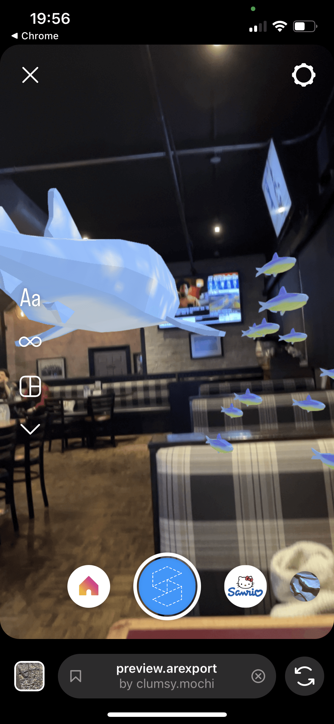
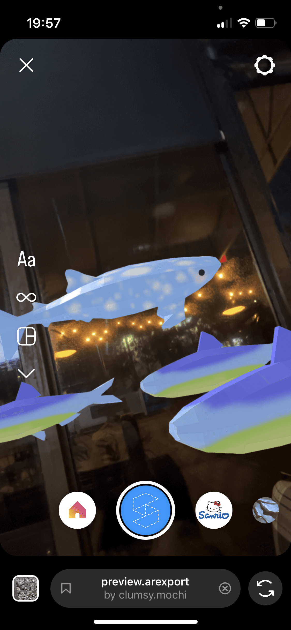
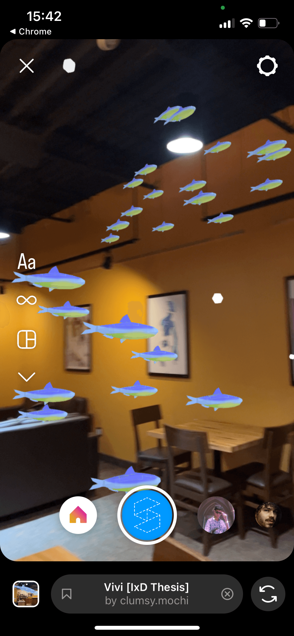
After completing all of the 3D assets in Blender, I moved on to arranging and uploading them onto Meta Spark Studio! ✨
The process was somewhat trial and error as I encountered mismatches between file formats of the two apps, however after troubleshooting and researching more about Meta Spark I got it to work.
The resulting AR filter was uploaded to Instagram and Facebook with view access to anyone who has the app on their phone.
Users who tested the experience gave extremely positive feedback! 🐠
Branding
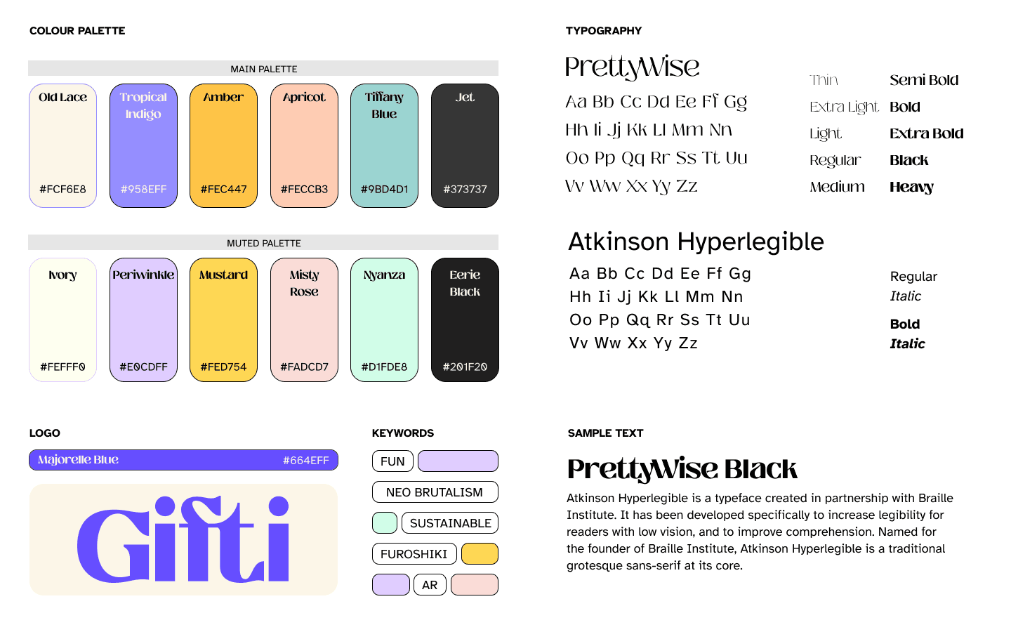
I worked on finalising a simple branding style sheet before starting to build the mobile web prototype in Figma. I brought to life what I envisioned Gifti branding would look like by choosing the appropriate colours that composed a fun and exciting palette, and pairing fonts that go well with each other. 🎨
journey map & figma prototype
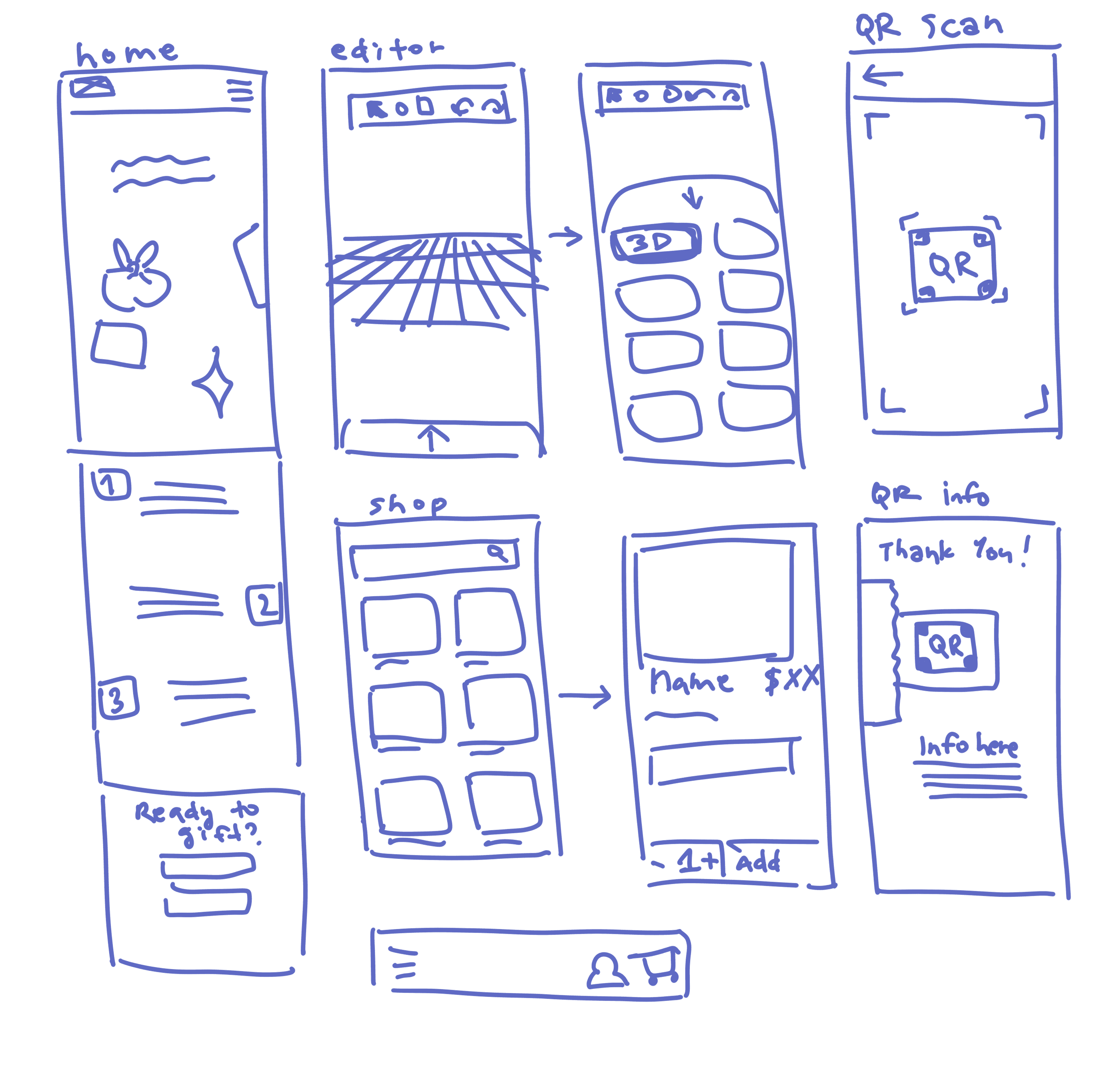
After the style sheet was completed, I began brainstorming and sketching out the web app screens to start mapping out the user journey. 📍
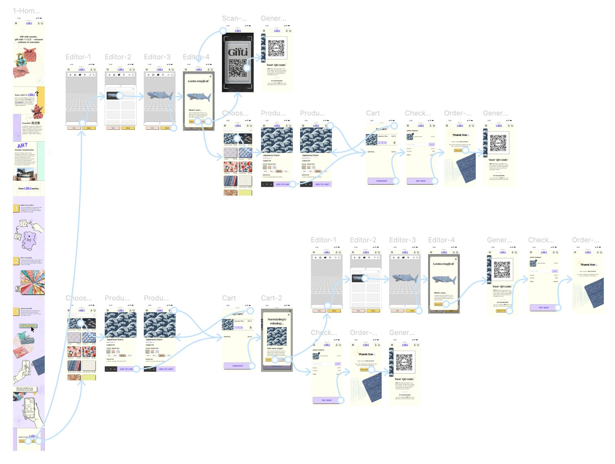
With the base screens sketches completed, I moved onto Figma to start building an interactive prototype that would become the starting point for the user journey in exploring my product.
I had to take into consideration the interface and contents of each page in order to properly convey the mission, function, and benefit of Gifti.
outtakes
With the prototype ready to be tested at its highest fidelity, I was able to recruit users to give me feedback after going through the Figma prototype followed by the AR aquarium viewing! 🎉
At this final stage I was making small tweaks and fixes to the mobile prototype and filming and editing a video to showcase the product. 🎥
final stretch
Final prototype & grad showcase. 🎉
The final deliverables that showcase the final product are a prototype and a video trailer that demonstrates functionality and explains purpose of Gifti. I combined filmed and pre-existing clips along with fitting soundtracks and visuals in order to best convey the voice and style of my design concept! 🎬
The video editing was done in Premiere Adobe Pro which I learned along the way. The prototype showcases the user flow for the web app and goes over all of the key features and functions of the product.
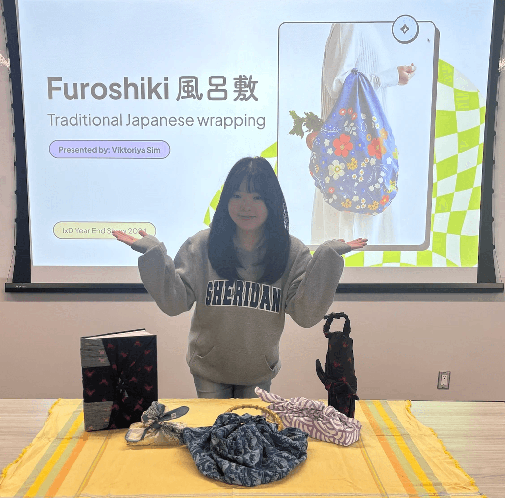
I had the chance to engage with a live audience by presenting my project and leading an interactive workshop during our graduation year end show. 🎤 It was a fun and exciting experience that served as a great finale and reward for all of my hard work throughout the last two semesters in the Interaction Design undergrad program.
Thank you for reading through and reaching the end of my journey! 🎉
vivisim.design@gmail.com

Made with luv (ノ´ヮ`)ノ 🩵 ©2024 all rights reserved
