Sandwich Infographic.
Designing an infographic for bakery's employee training purposes from start to finish 🥪
my role.
Graphic Designer
team.
Vivi Sim (me!)
tools.
Adobe Illustrator
Adobe Indesign
Adobe XD
Procreate App
timeline.
4 weeks
overview
A sweet opportunity.
Black Forest Pastry Shop is a family owned bakery known for its quality baked goods located downtown Oakville. Being a part of BIA (business improvement association), it is a popular lunch spot among other stores' workers and regular customers alike. 🍰
Training responsibilities fall on the more experienced workers, and during the busy season it may prove challenging keeping an eye on the new employees a 100% of the time.
Challenge
Task made easier with instructional graphics.
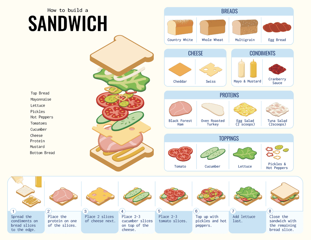
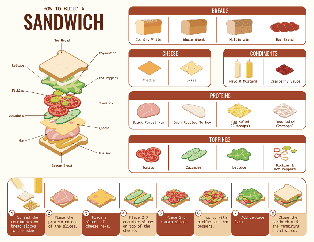
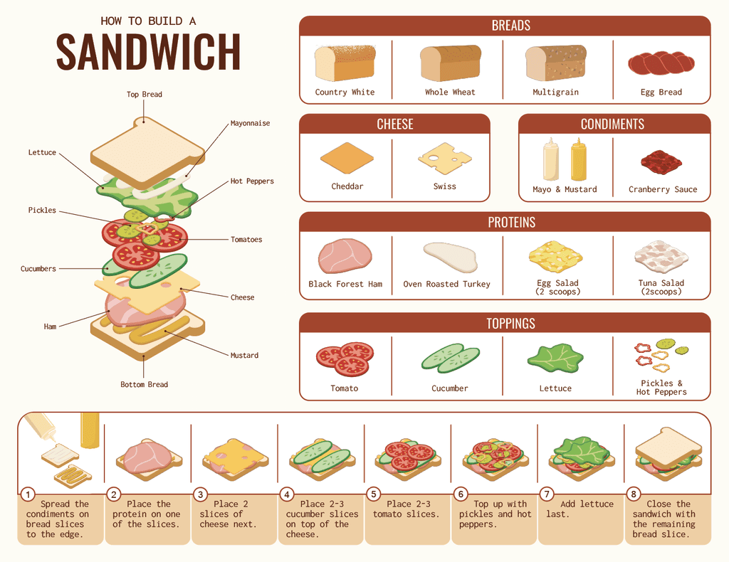
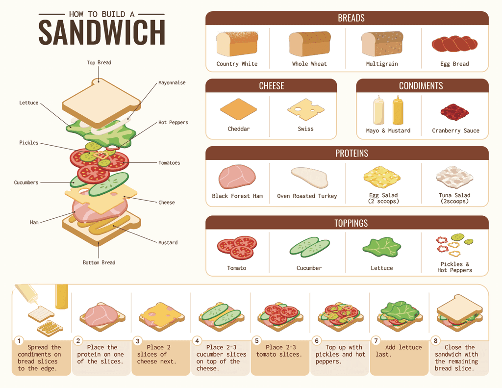
How might we make an easy to follow visual instruction for new employees on proper ingredient order placement when making sandwiches?
I was given the task of creating an easy to understand instructional infographic aimed to help new team members to memorise the correct way of making sandwiches for the customers.



research
Collecting the references.
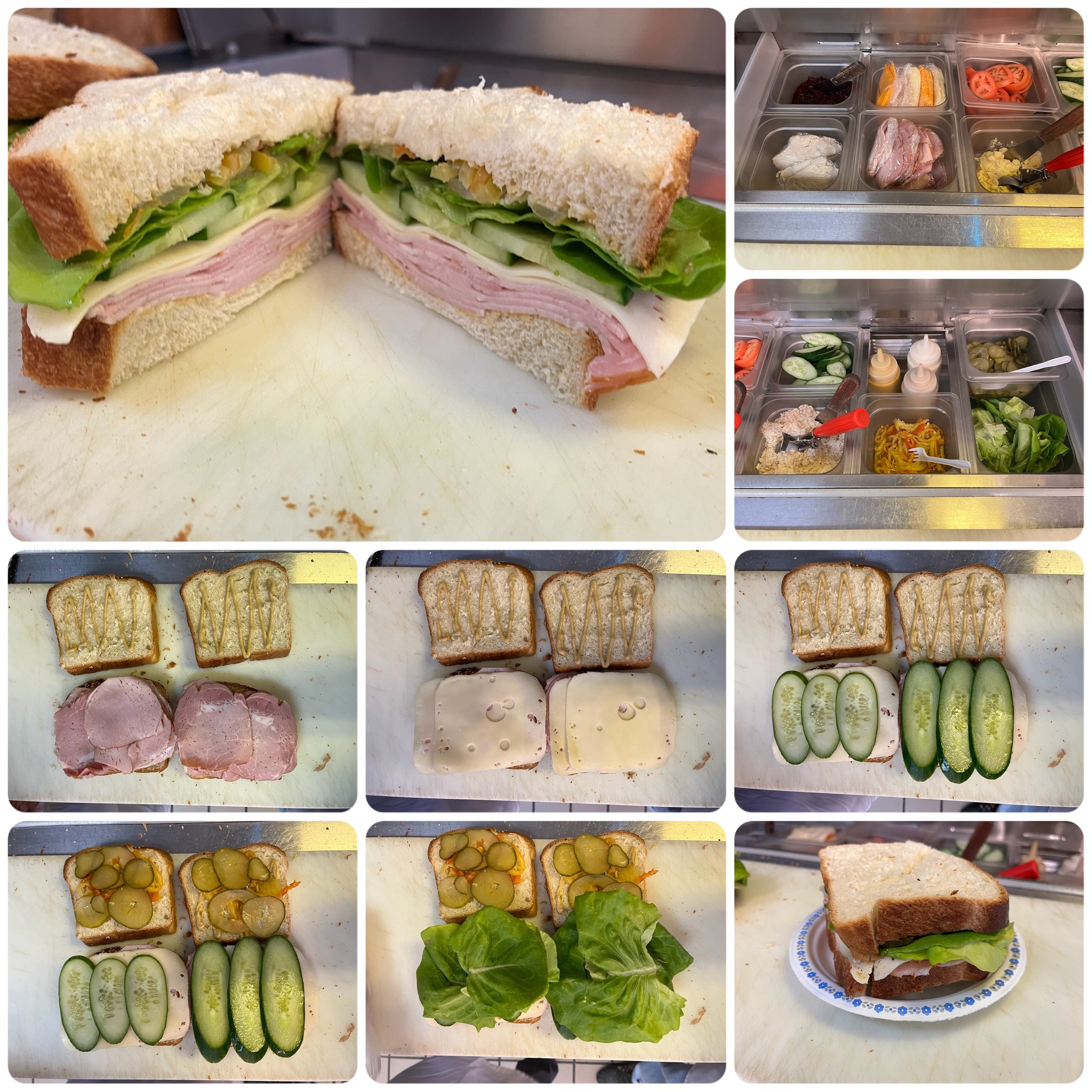
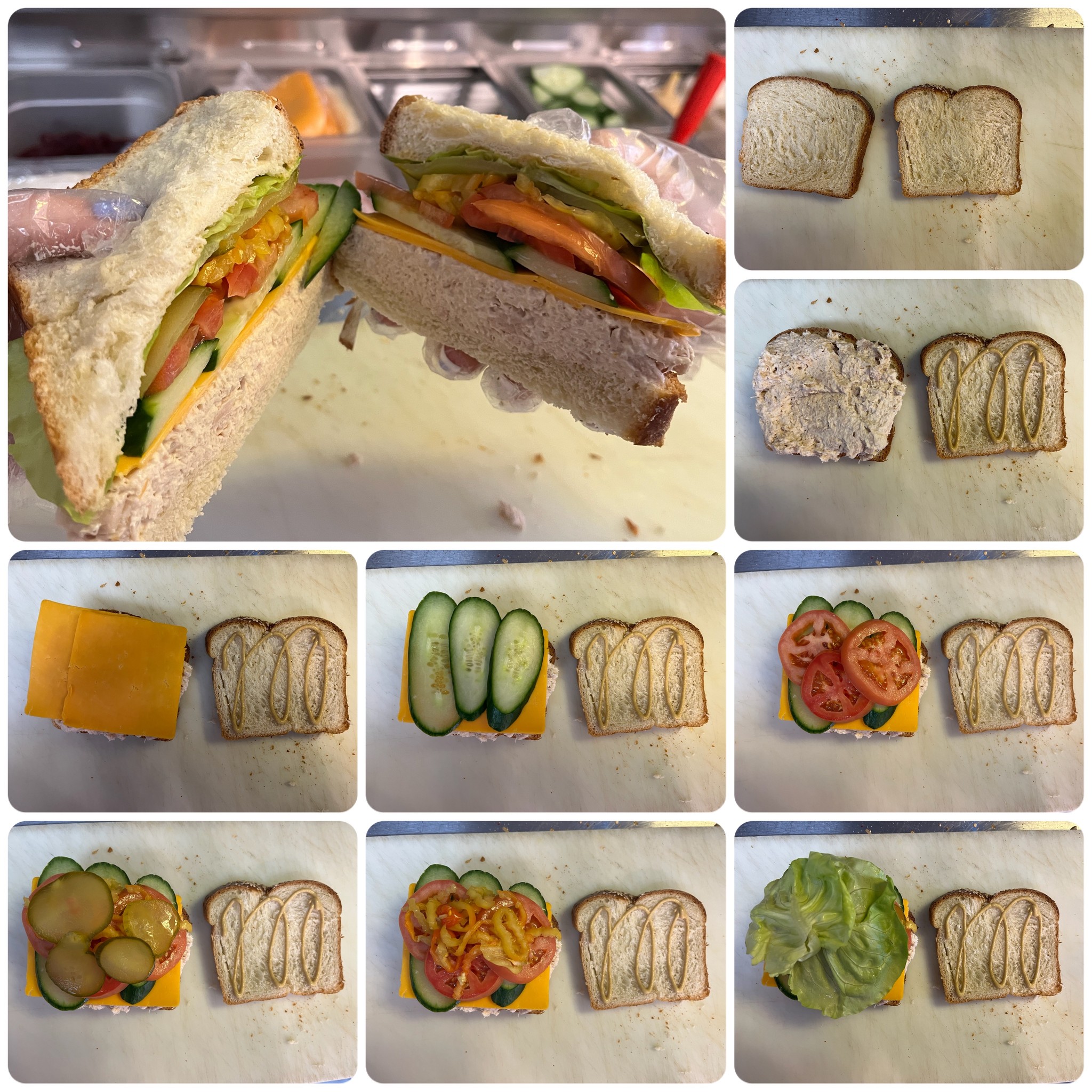
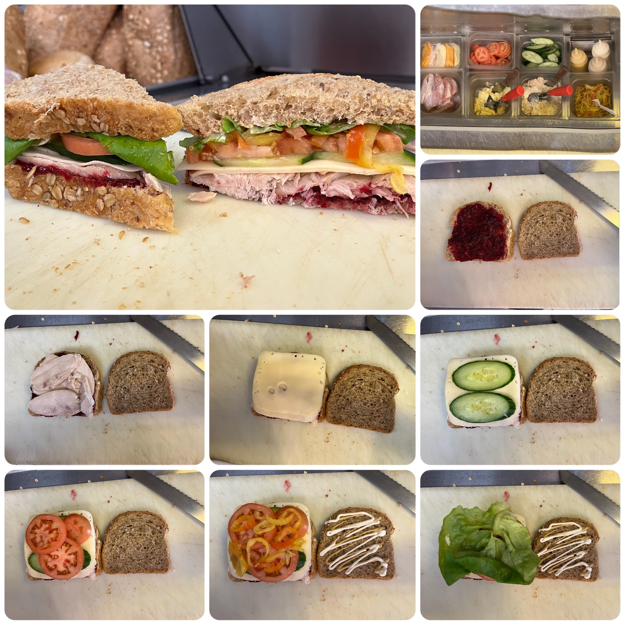
My design process began with documenting the sandwich ingredients available at the bakery. I took photos of the sandwich bar as well as the step by step process of making a sandwich in a correct order.


assets
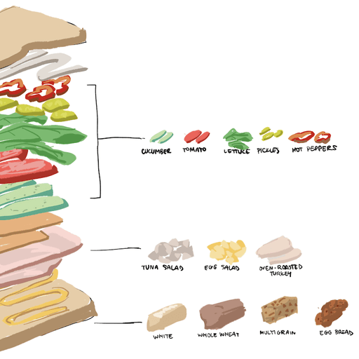
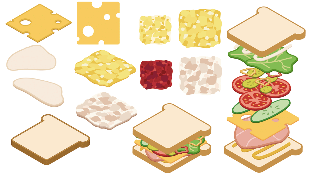
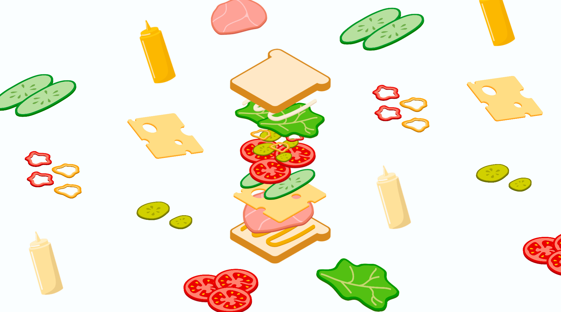
Illustrating the ingredients.
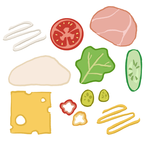
After collecting enough reference photographs I sketched the individual assets in Procreate. My goal was to make each ingredient look recognisable and appealing to the eye. 🎨
When I was happy with how they look, I moved to Adobe Illustrator to create vector files that would be used in the infographic.
I experimented a 3D illustration style but ultimately settled on the isometric and clean look to make each ingredient identifiable.


type & layout
Typography study & layout.
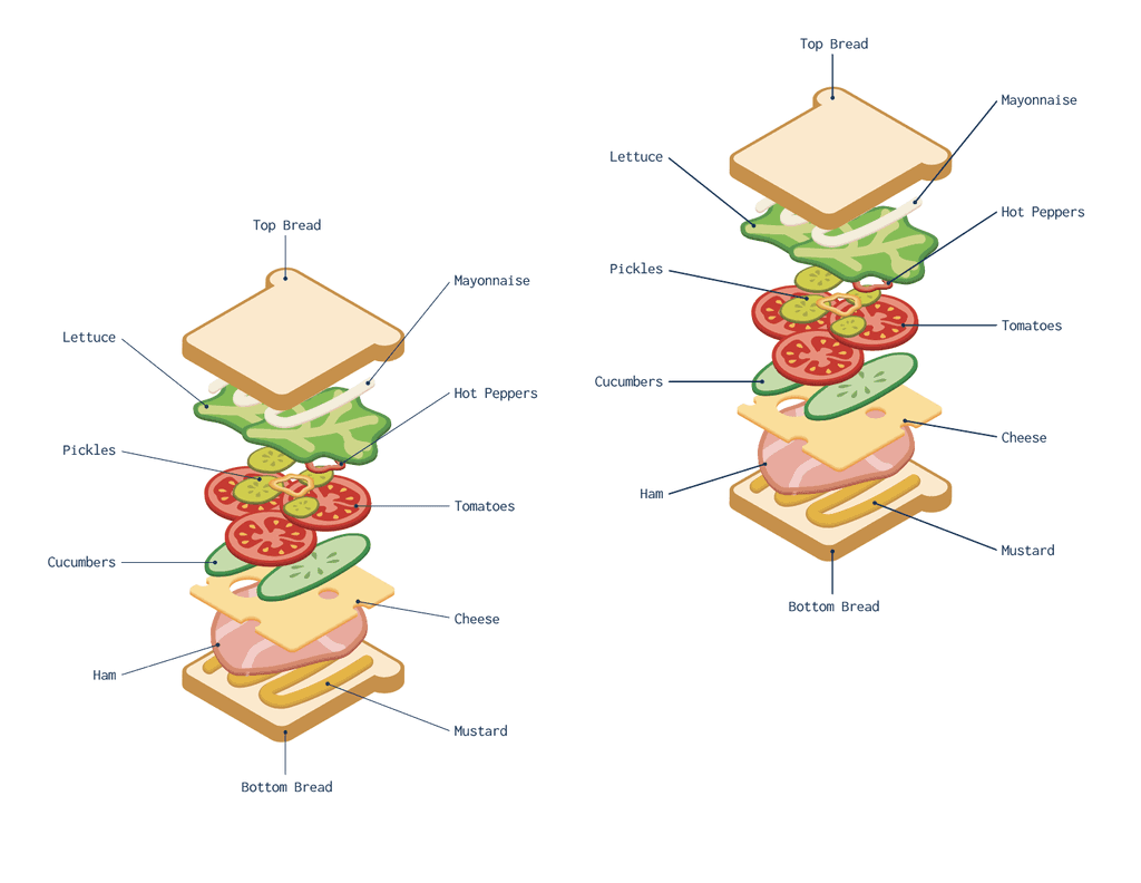
In order to make the infographic legible I conducted a font study that helped determine what type faces work best for this design. Placing paired up fonts next to each other on the canvas made it easier to compare and contrast.
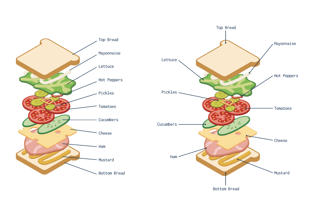
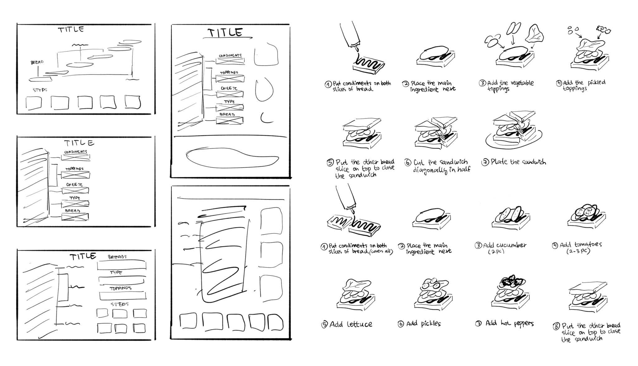
Sketching out several layouts along with the steps to be included in the infographic helped me to plan ahead and consider the architecture of the design. Exploring different variations at an earlier stage ensured that I would start working on the final document with a solid idea of the overall design. 📐



final design
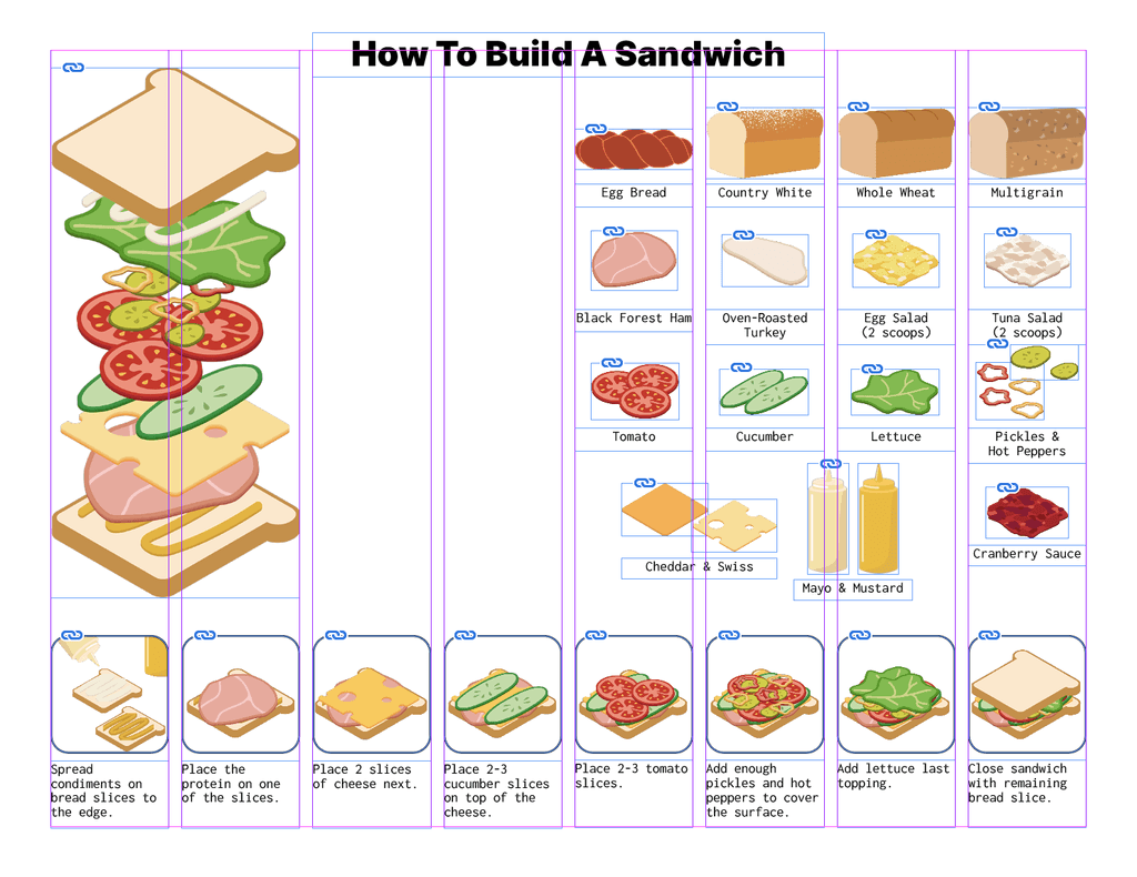
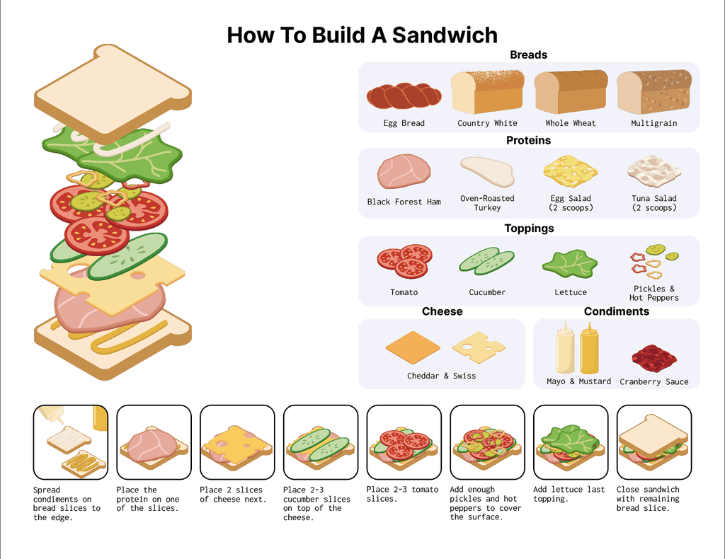
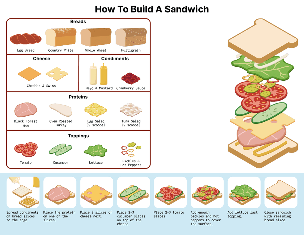
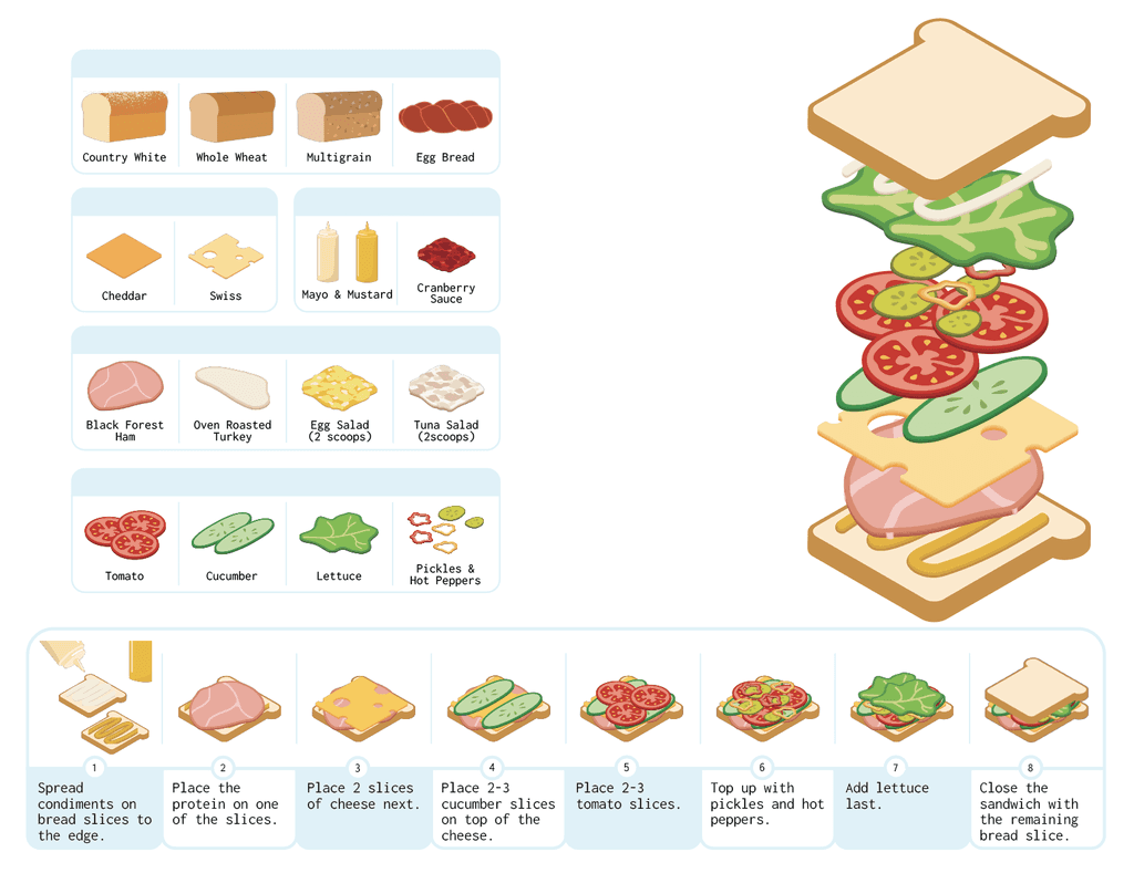
Progress snippets. 👀
Progress screenshots and images I saved along the way!


conclusion
Final thoughts & outtakes.
Working on this project showcases how important the research and preliminary work are. By utilising my illustration and design skills I achieved a clean final design that is easy to read and understand.
I honed my Adobe Indesign and Adobe Illustrator skills throughout the process of visualising many iterations. I was able to let go of the initial design decision as a better alternative was possible when deciding on the colours for the infographic's background and assets. Instead of dwelling and trying to salvage something that won't make it to the final design, I tried a different approach resulting in a better visual outcome.
Paying attention to the smallest details really made a difference in the end. Even though not every user might notice when something doesn't line up perfectly, sometimes just looking from a distance might reveal inconsistencies otherwise unnoticed at a glance. This project became a valuable experience in addressing all of my client's requirements and building a finished product from start to finish while creating the assets managing my own time.
The final copy was printed and displayed at Black Forest Pastry Shop located in downtown Oakville! 📷

