Landing Page.
Designing a landing page with CTA for an animal rescue organisation 🐶🐱
my role.
Graphic Designer
team.
Vivi Sim (me!)
tools.
Adobe Illustrator
Adobe XD
Adobe Photoshop
Procreate App
timeline.
3 weeks
overview
Designing for a good cause.
Vet Ranch is a charity group that specializes in rescuing stray animals, rehabilitating them by providing medical support. They are trying to spread awareness to people about the lives and struggles of homeless animals, as well as to encourage people to adopt pets who are in need of new homes.
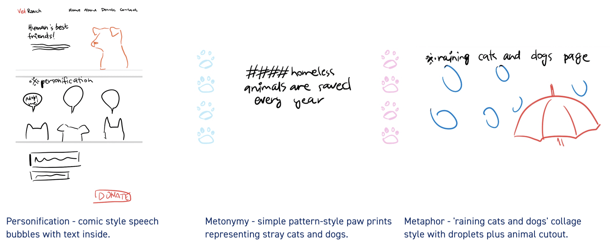
This landing page project uses the 'raining cats and dogs' metaphor, paw prints as an inconspicuous metonymy pattern, and personification as rhetorical tropes in order to persuade the users to donate to the cause.
Challenge
Compelling with visual narrative.
How might we create a landing page with a persuasive call to action in order to successfully encourage the users to donate to the cause?
In this project I worked on creating appealing graphics and arranging them in a landing page format to convey the intended narrative and encourage user engagement with the organisation. 🤳
My focus was on crafting aesthetically pleasing visuals that could stir emotional responses among the audience. I challenged myself to use narratives as an inspirational outlet for creative and engaging visual keys.


user
Empathy map & persona.
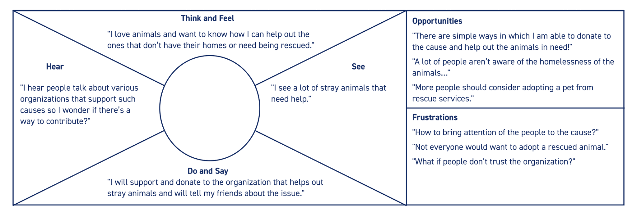
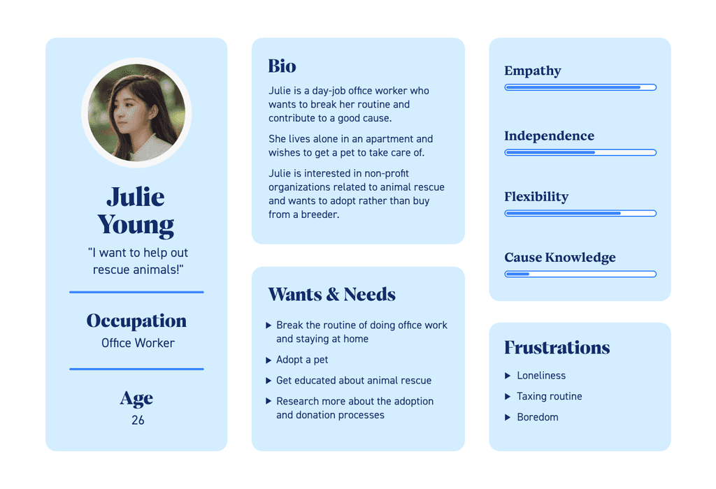
In order to find ways in which I could appeal to the people, I created an empathy map that outlines emotions and thoughts of a potential user. Additionally, I drafted a quick persona profile to further match my product to its intended audience.



style & moodboard
Style exploration.
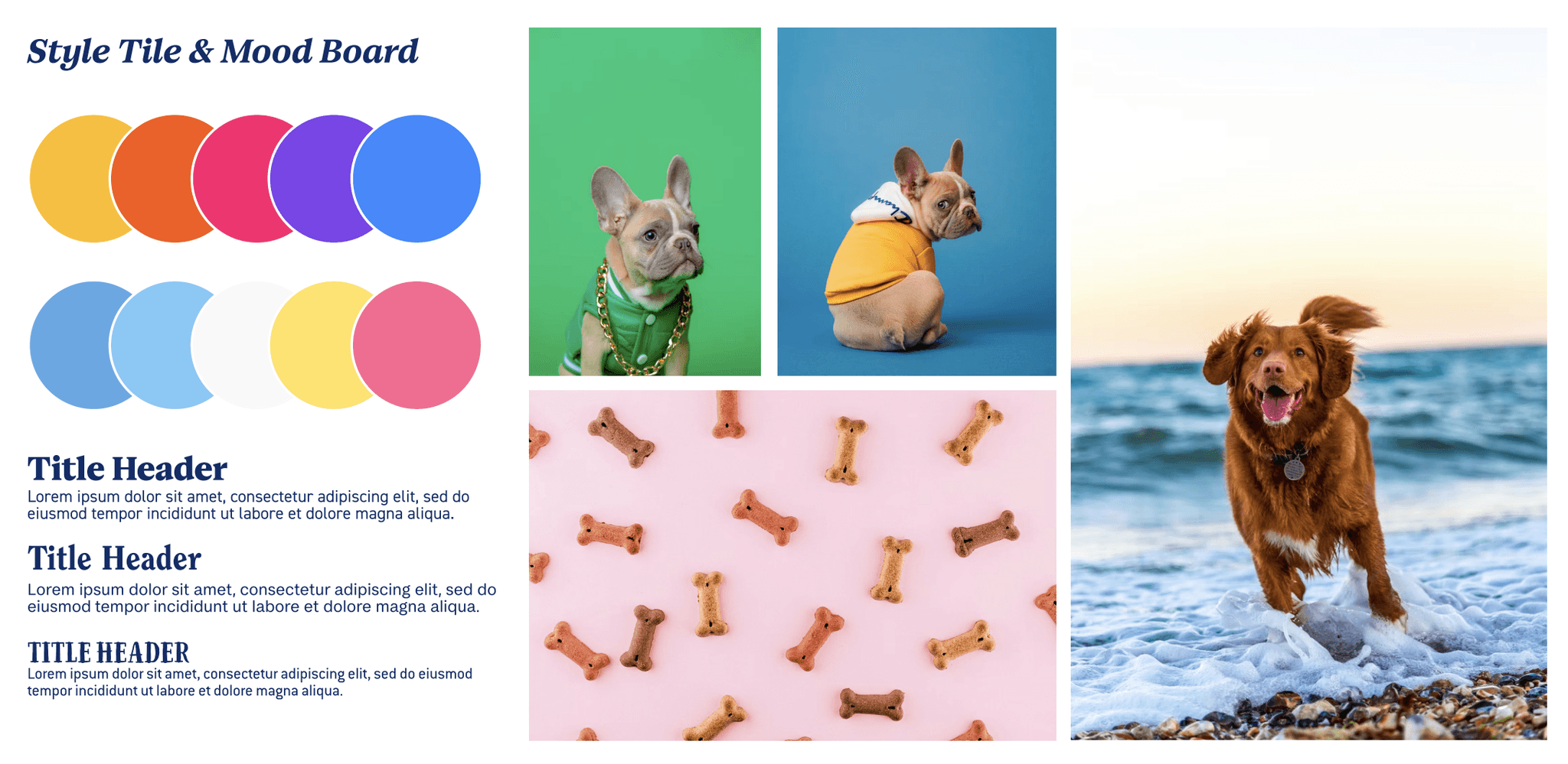
I put together a simple mood board for an easier visualization of the mood and style my landing page design would adopt at later stages in the project. I focused on creating a happy and positive style that would reflect via bright and fun colours.


assets
Initial sketches & asset creation.
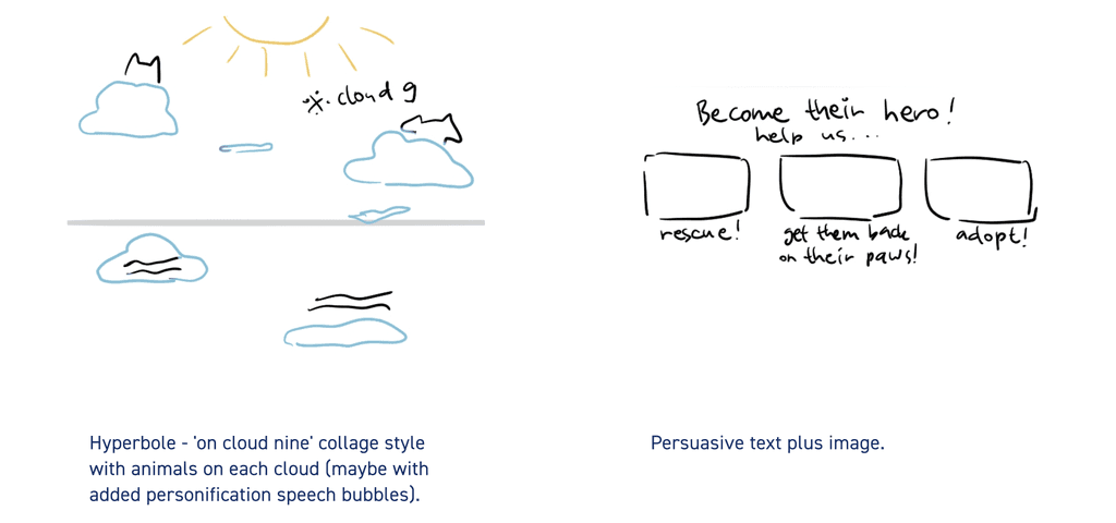
Sketching out the ideas inspired by several rhetorical tropes helped me visualise and decide between the ones that would work best in persuading the users.
All of the assets used in the landing page design were created to match a paper collage aesthetic. I chose friendly and fun colours for the patterns and other elements when creating them in Adobe Photoshop. Below you can view the work in progress screen captures I took while working on the assets.


final product
Landing page prototype.
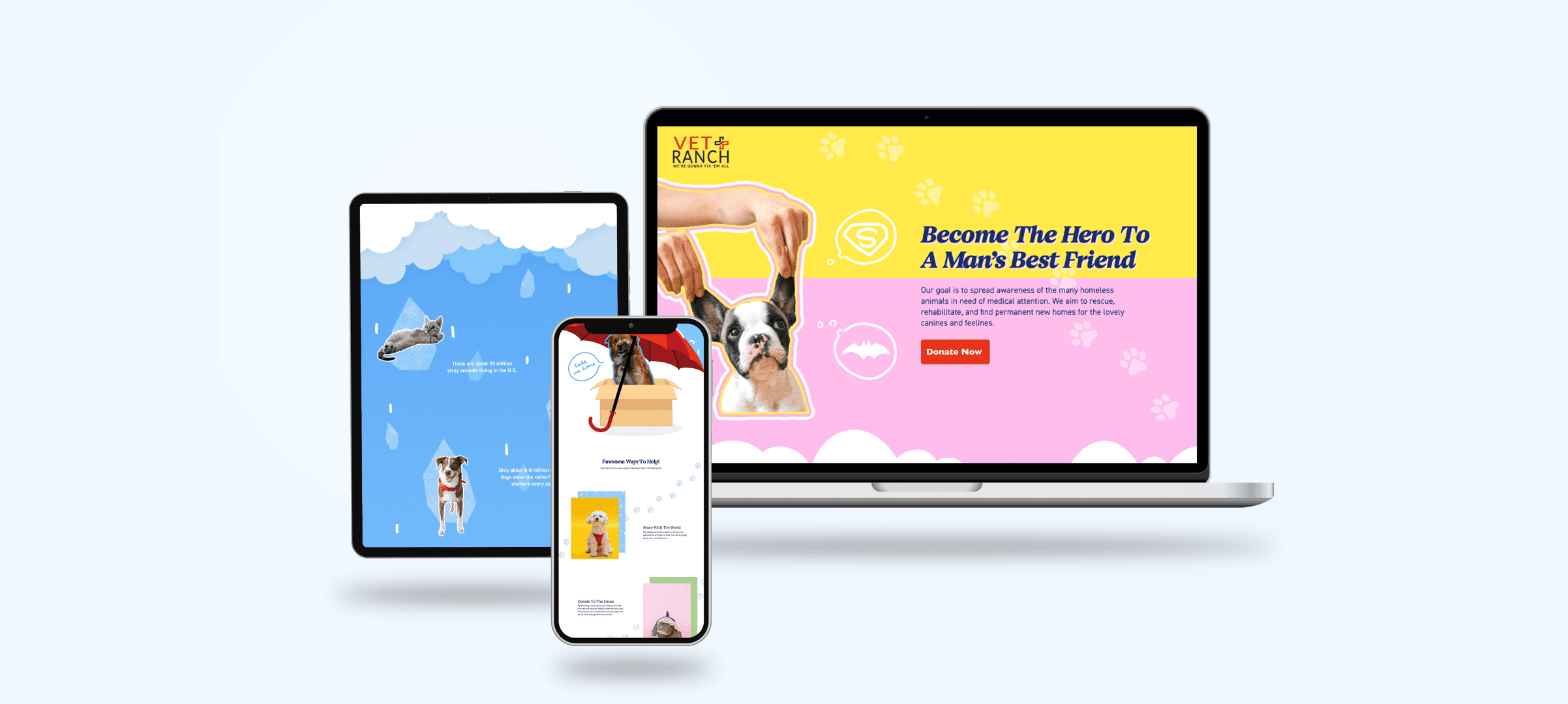
On the final design for the landing page I arranged created assets in a way that continuously narrates going from one section of the page to the next. I created a fluid design that stays connected and visually informs the user of the site's purpose as well as the CTA.


conclusion
Final thoughts & outtakes.
Throughout this project I was able to learn to effectively use visual rhetorical tropes with the goal of calling the audience to action. Brainstorming and grasping the meaning of each rhetorical trope type helped me narrow down the list of ideas to the most effective and suitable tropes for my landing page.
At the beginning of the creation process I settled on a specific style tile considering the purpose and target audience of the site. I used my photo editing skills in order to create all of the assets for the landing page.
Ultimately, this landing page utilizes narrative and persuasive visual elements that work as a CTA in order to encourage the target users to learn more about the cause and donate to the organization.


vivisim.design@gmail.com

Made with luv (ノ´ヮ`)ノ 🩵 ©2024 all rights reserved

